Vite+ design research
A full design review of viteplus.dev, the site for Vite+, the unified JavaScript toolchain from VoidZero. Captured on 2026-11-21 at 1440 × 900, with phone (390) and tablet (768) captures of the home page and the docs.

The site in one paragraph
Vite+ is a developer tool, and the site is built for developers who distrust marketing. The page is a ruled engineering sheet: a 1440px column framed by 1px hairlines, with small triangle "ticks" where rows meet. Inside that frame, the site alternates white technical panels (isometric line drawings, command chips, stats) with a near-black product band where each tool sits beside a loud grainy light-streak texture in its own colour. Type is three families with three jobs: APK Protocol for headlines, Inter for reading, KH Teka Mono for anything a terminal would print. The brand colour is one electric indigo, #4f30e8, used for links, the eyebrow and a light sweep across the hero headline. The docs are stock VitePress, re-skinned with the same three fonts and indigo.
How to read this research
| Doc |
What it covers |
| 01 · Design principles |
The eight rules behind the site, and why each one fits a developer audience |
| 02 · Color system |
Every named colour token, measured, with WCAG contrast ratios |
| 03 · Typography |
The three families, where to get them, the full measured scale |
| 04 · Layout, grid and spacing |
The ruled 1440 frame, the split rows, spacing steps |
| 05 · Heroes |
The centred hero and the terminal stage under it |
| 06 · Section types |
Every section pattern on the site, named and measured |
| 07 · Copywriting and voice |
Headline formulas, proof numbers, command-as-copy |
| 08 · Components |
Nav, buttons, chips, tabs, code blocks, callouts, cards, footer |
| 09 · Art direction |
Isometric line art, light-streak textures, logos, the wordmark |
| 10 · Brand assets and graphics |
Inventory of every graphic type, how it is made, how to recreate it |
| 11 · Motion and interaction |
Measured transitions, keyframes, hover states, reduced motion |
| 12 · Glossary |
The words you need to brief or build a page like this |
| 13 · Build recipe |
Paste-ready CSS tokens and component CSS |
| Public pages |
All 84 public pages, with the ones captured here marked |
Page reviews:
- Home: 18 sections, top to bottom.
- Docs template: the guide, config and package-management pages, in dark and light.
- Team: the one non-docs content page.
- Header and footer: the two navigation systems (marketing and docs).
Pages captured
The site has no blog, changelog, pricing or customers page. See Public pages.
Method
- Screenshots:
agent-browser 0.27, Chrome, 1440 × 900 viewport, full-page after a slow scroll so lazy content loads.
- Measurements:
getComputedStyle on every visible element (data/<page>.json), plus a deeper probe of fonts, custom properties, transitions, keyframes, radii and shadows (data/home.probe.json, data/home.themevars.json).
- CSS: the production stylesheet
/assets/style.CHL6M4o1.css (260 KB) was read for rules that only apply on hover or in pseudo-elements.
- Values marked ≈ are read from pixels, not from CSS.
What is not covered
- The three
<canvas> drawings on the home page (download stats, engineering time, isometric grid) draw in JavaScript. Their frame timing cannot be read from CSS. 11 · Motion says what was observed.
- The "View Prompt" dialog and the DocSearch modal were not opened.
Public pages
Every public page on viteplus.dev: 84 pages on the site, plus 8 off-site links from the nav and footer.
How the list was built. viteplus.dev/robots.txt and /sitemap.xml both return the VitePress 404 page (checked with curl on 2026-11-21). VitePress ships a window.__VP_HASH_MAP__ object in /assets/chunks/metadata.*.js that names every built Markdown page. The list below is that map, with titles taken from the theme sidebar. The raw data is in data/public-pages.json.
What the site has and does not have. Vite+ has no blog, changelog, pricing or customers page on this domain. Release notes live on GitHub Releases, and the 1.0 announcement lives on voidzero.dev. Both are linked below.
Pages marked captured have a full-page screenshot and a review in this research.
Marketing (2)
Guide (31)
Package management (41)
Config (10)
Linked off-site (nav, social) (8)
01 · Design principles
Eight rules explain almost every decision on viteplus.dev. Each one is stated as a rule, shown with evidence from the page, and explained.
1. The page is a ruled engineering sheet
Rule. Every section sits inside one 1440px column with 1px side rules, and every row starts with a 1px top rule. Where a row begins, a 5px triangle "tick" points in from each side rule.
Evidence. .wrapper { max-width: 90rem; border-left: 1px; border-right: 1px; border-color: #e5e4e7 }. .wrapper--ticks:before draws a CSS triangle (border-left: 5px solid #e5e4e7, top: -5px). Split rows use Tailwind divide-x for the centre rule.
Why. The audience is engineers. A frame of hairlines reads like a spec sheet, a blueprint or a terminal pane layout. It says "precise" without a single adjective. It also makes a very mixed page (texture photos, line art, code, stats) look like one system, because every piece is clipped to the same grid.
2. Three typefaces, three jobs
Rule. APK Protocol for display, Inter for reading, KH Teka Mono for anything a machine would print: commands, eyebrows, tab labels, terminal output, and file names in the art.
Evidence. --font-heading: "APK Protocol", --font-sans: Inter, --font-mono: "KH Teka Mono". On the home page, 117 text nodes are mono, 92 are Inter, 30 are APK Protocol (counted from data/home.json).
Why. Each family carries a meaning. Mono says "this is real output, you can type this". Inter stays quiet so the claims can be read fast. The display face gives the brand a voice that is not Inter, which almost every dev-tool site already uses.
3. Show the command, not a screenshot of an app
Rule. Product proof is a terminal: vp create, vp check, vp run --cache build. Each feature row pairs a claim with the exact command and its exact output.
Evidence. Six terminal windows on the home page, all set in KH Teka Mono 14/24 with syntax colour. The install row is two copy-paste blocks: curl -fsSL https://vite.plus | bash and irm https://vite.plus/ps1 | iex.
Why. Vite+ has no GUI. The product is the CLI. A developer trusts output they could reproduce more than a polished mock. The commands also double as onboarding: reading the page teaches the verbs create · dev · check · test · build · run · pack.
4. Light page, dark product band
Rule. The page is white. The middle third (2,816px of 8,806px) is one near-black band, #16171d, that holds the five tool rows. The footer returns to near-black.
Evidence. Section backgrounds in data/home.probe.json: bg-primary from y=2953 to y=5769, and from y=7405 to the end.
Why. White sections carry the argument (why one toolchain, trust, speed). The dark band carries the product (what each command does). The switch to dark marks "now you are inside the tool", the same way a terminal is dark. It also gives the colour textures the dark ground they need to glow.
5. Every tool gets its own colour field
Rule. Each of the five tool rows has a full-bleed, grainy light-streak texture in a different hue: violet (Vite), cyan (Oxc), green (Vitest), indigo (Vite Task), orange (Rolldown).
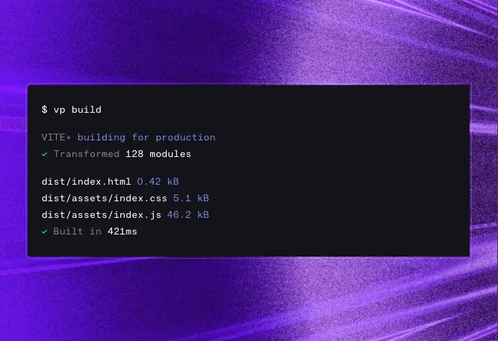
Why. Vite+ bundles five existing open-source projects. Colour lets a reader feel that each part is a real, separate product with its own identity, while the identical layout (claim left, terminal right) says they are one system. The textures are the only loud thing on the page, so they become the memory of it.
6. One accent colour, used for signal only
Rule. Indigo #4f30e8 (light) / #6b77f8 (dark) appears on: the eyebrow "Vite+ 1.0 is here", text links in docs, the inline code colour in docs, the sweep across the hero headline, and the edge of the isometric board. It never fills a large area on white.
Why. On a page with five loud textures, the brand colour has to be the calm constant. Keeping it to text and edges lets it mark "this is Vite+" in the art and "this is clickable" in the docs.
7. Isometric line drawings explain architecture
Rule. Every abstract idea (speed, time saved, framework support, how tools stack) is a thin-line isometric drawing in grey with indigo-gradient solids for the hero object.
Evidence. Three Rive animations (stay_fast_at_scale.riv, focus_on_shipping_v2.riv, vite__masthead.riv) plus PNG illustrations (meta-frameworks.png, productivity-security.png).
Why. An isometric drawing is the visual language of systems diagrams. It shows layering (Vite+ on top of Vite, Vitest, Rolldown, Oxc) better than a flat icon row can, and it looks engineered, not decorative.
8. The docs are the product, so they get the same brand
Rule. The 82 docs pages are stock VitePress (generator: VitePress v2.0.0-alpha.20) with the theme variables re-pointed to the brand fonts and indigo. Docs follow the system theme; the marketing page forces light (data-theme="light").
Why. Most of the time a developer spends on viteplus.dev is in the docs. Using VitePress keeps them fast and familiar (Vite's own docs use it). Re-skinning only the tokens means the docs feel like the same brand at near-zero maintenance cost.
02 · Color system
All values are read from the live CSS custom properties (data/home.themevars.json) and from getComputedStyle on elements. Contrast is WCAG 2.x relative luminance.
The named palette
Vite+ names its colours like materials, not like roles. The names come from the --color-* tokens in the Tailwind v4 theme.
| Token |
Hex |
Where it is used |
--color-primary |
#16171d |
Text on white, the dark product band, footer, docs dark background, button fill |
--color-white |
#ffffff |
Page background, text on dark |
--color-midnight |
#0c0912 |
Deepest violet-black (defined; not seen in a large area) |
--color-slate |
#14121a |
Docs dark sidebar and code background (--vp-c-bg-alt in dark) |
--color-wine |
#140033 |
Terminal stage background under the texture image |
--color-space |
#110033 |
Inline code text on light (#103) |
--color-nickel |
#3b3440 |
Hero sub-headline, dark-mode hairlines |
--color-grey |
#867e8e |
Body copy on white, eyebrows, labels, inactive tabs |
--color-stroke |
#e5e4e7 |
All hairlines on white: frame, row rules, button outline |
--color-beige |
#f4f3ec |
Warm off-white panel (meta-frameworks panel reads #f9f8f5) |
--color-electric |
#6c3bff |
Base brand violet |
--color-brand (light) |
#4f30e8 |
The working brand colour on white |
--color-brand (dark) |
#6b77f8 |
The working brand colour on dark docs |
--color-vite |
#b39aff |
Pale violet (Vite's own brand tint) |
--color-ruby |
#863bff |
Purple accent |
--color-aqua |
#32f3e9 |
Inline code on the dark band (Prettier, ESLint, tsgo) |
--color-zest |
#22ff73 |
Terminal success green |
--color-fire |
#ff5500 |
Orange accent (Rolldown) |
| shine sweep |
#6254fe |
The light band that crosses the hero headline |
| terminal window |
#111111 |
Terminal panel fill on the stage |

How colour is distributed
Background colours measured on the home page (data/home.json → bg):
- White and transparent: most of the page height.
#16171d: 2,816px product band + 1,401px footer = 48% of the 8,806px page.- Texture images: 5 tool panels (each 720 × ≈480), the 640px terminal stage, the 434px footer CTA.
The rule: neutrals do the structure, textures do the emotion, indigo does the signal.
Text colour roles
| Role |
Light page |
Dark band / docs dark |
| Headline |
#16171d |
#ffffff |
| Sub-headline / lead |
#3b3440 (hero only) |
rgba(255,255,255,.7) |
| Body |
#867e8e |
rgba(255,255,255,.7) |
| Eyebrow / label (mono, caps) |
#867e8e |
#867e8e |
| Brand / link |
#4f30e8 |
#6b77f8 |
| Inline code |
#110033 text, transparent fill, 1px #e5e4e7 outline |
#32f3e9 or #b39aff text on rgba(59,52,64,.5) (bg-nickel/50) |
WCAG contrast
| Pair |
Colours |
Ratio |
Result |
| Headline on white |
#16171d on #ffffff |
17.9:1 |
AAA |
| Hero lead on white |
#3b3440 on #ffffff |
12.0:1 |
AAA |
| Body grey on white |
#867e8e on #ffffff |
3.9:1 |
Fails AA for body text; passes for 18px+ |
| Brand on white |
#4f30e8 on #ffffff |
7.2:1 |
AAA |
| Shine purple on white |
#6254fe on #ffffff |
5.0:1 |
AA |
| White on product band |
#ffffff on #16171d |
17.9:1 |
AAA |
| White 70% on band |
≈#b9b9bb on #16171d |
9.1:1 |
AAA |
| Grey label on band |
#867e8e on #16171d |
4.6:1 |
AA |
| Aqua code on band |
#32f3e9 on #16171d |
12.9:1 |
AAA |
| Zest on band |
#22ff73 on #16171d |
13.3:1 |
AAA |
| White on terminal stage |
#ffffff on #140033 |
19.5:1 |
AAA |
| Docs text-1 light |
#3c3c43 on #ffffff |
10.9:1 |
AAA |
| Docs text-2 light |
#67676c on #ffffff |
5.6:1 |
AA |
| Docs text-3 light |
#929295 on #ffffff |
3.1:1 |
Large text only |
| Docs text-2 dark |
#98989f on #16171d |
6.2:1 |
AA |
| Docs text-3 dark |
#6a6a71 on #16171d |
3.3:1 |
Large text only |
| Brand on docs dark |
#6b77f8 on #16171d |
4.8:1 |
AA |
The one weak spot. Body copy on white is #867e8e at 3.9:1. It is set at 18px, which passes the large-text bar only at 18.66px bold or 24px regular, so strictly it fails AA. The choice is deliberate: grey body makes the near-black headlines and the mono labels stand out. If you copy the look, use #6e6776 (≈5.2:1) for the same feel with a pass.
Why this palette
- Near-black, not black.
#16171d has a faint blue-violet bias. Next to the violet textures, pure black would look dead; this black looks like the inside of the same light.
- Warm greys.
#867e8e and #3b3440 lean slightly red-violet. They belong to the violet family of the brand, so grey text never fights the indigo.
- Electric colours only on dark. Aqua, zest and fire would vibrate on white. The site only uses them on
#16171d or inside texture images.
- Two brand values.
#4f30e8 is darker so it passes 7:1 on white; #6b77f8 is lighter so it reads on near-black. Same hue family, tuned per surface.
Dark mode
The marketing page forces light: <html data-theme="light" data-variant="viteplus">. The docs follow prefers-color-scheme via VitePress's vitepress-theme-appearance key, with a switch in the nav.
| Token |
Light |
Dark |
--vp-c-bg |
#ffffff |
#16171d |
--vp-c-bg-alt (sidebar, code) |
#f6f6f7 |
#14121a |
--vp-c-text-1 |
#3c3c43 |
#ffffff |
--vp-c-text-2 |
#67676c |
#98989f |
--vp-c-divider |
#e2e2e3 |
#2e2e32 |
--color-brand |
#4f30e8 |
#6b77f8 |
03 · Typography
Three families, each with one job. All sizes below are computed values at a 1440px viewport unless a row says otherwise.
The families
| Family |
Role |
Files served |
Foundry and licence |
Free substitute |
| APK Protocol |
Display: H1–H4, nav links, docs headings, sidebar group titles |
APK-Protocol-Medium.woff2 (500), APK-Protocol-Semi-Bold.woff2 (700) |
Commercial; not on Google Fonts. The foundry is not verified here (the font files carry no foundry in their names). Search the family name before licensing. |
Geist 500, or Inter Display 500 with letter-spacing:-0.05em at 60px |
| Inter |
Body, buttons, stats, footer links |
Self-hosted variable inter-roman-*.woff2, inter-italic-*.woff2, weight axis 100–900, font-display: swap |
Free, SIL OFL, rsms.me/inter |
— |
| KH Teka Mono |
Terminal output, commands, eyebrows, tab labels, code in docs, file names in the art |
KHTekaMono-Regular.woff2 (400), KHTekaMono-Medium.woff2 (500) |
Commercial. "KH" is the prefix Kilotype uses for its families (KH Teka); treat the foundry as likely, not verified. Web licence needed. |
Geist Mono, JetBrains Mono or IBM Plex Mono |
| Punctuation SC |
Chinese punctuation only (:root:where(:lang(zh))) |
4 weights |
VitePress default |
— |
Font tokens (data/home.themevars.json):
--font-heading: "APK Protocol", sans-serif;
--font-sans: Inter, sans-serif;
--font-mono: "KH Teka Mono", monospace;
A detail worth knowing. VitePress declares --vp-font-family-base: var(--font-sans, "KH Teka", sans-serif). The fallback names a sans-serif KH Teka, but --font-sans is defined as Inter, so Inter always wins. The site likely planned KH Teka Sans for body and switched to Inter.
Weights in use. APK Protocol is loaded at 500 and 700 only. Docs headings ask for 600; the browser rounds that to the 700 file ("Semi-Bold"). Marketing headlines use 500. Inter is used at 400 and 500. Mono at 400 (and 500 in docs inline code).
Marketing scale (home page)
| Role |
Family |
Size / line height |
Weight |
Tracking |
Colour |
Example |
| H1 hero |
APK Protocol |
60 / 67.2 (1.12) |
500 |
−3px (−0.05em) |
#16171d + shine |
The Unified Toolchain for the Web |
| H2 section (dark) |
APK Protocol |
48 / 48 (1.0) |
500 |
−1.2px (−0.025em) |
#ffffff |
Everything you need in one tool |
| H3 statement |
APK Protocol |
40 / 53.3 (1.33) |
500 |
−1px (−0.025em) |
#16171d / #fff |
Fullstack? No problem. |
| H4 feature row |
APK Protocol |
30 / 36 (1.2) |
500 |
0 |
#16171d / #fff |
Blazingly fast builds |
| Card title |
APK Protocol |
24 / 28 |
500 |
0 |
#16171d |
Manages your runtime and package manager |
| Panel title |
APK Protocol |
20 / 28 |
500 |
0 |
#16171d |
Meta Frameworks |
| Nav link |
APK Protocol |
16 / 24 |
400 |
0 |
#16171d |
Guide · Config · Resources |
| Lead paragraph |
Inter |
18 / 28 |
400 |
0 |
#3b3440 (hero) / #867e8e / white 70% |
Manage your runtime, package manager… |
| Body (dark rows) |
Inter |
16 / 24 |
400 |
0 |
white 70% |
Spin up dev servers… |
| Feature bullet |
Inter |
16 / 24 |
400 |
−0.4px (−0.025em) |
#ffffff |
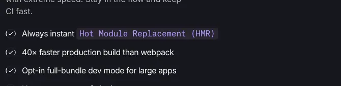
Always instant Hot Module Replacement |
| Stat number |
Inter |
20 / 28 |
500 |
0 |
#16171d |
274m+ |
| Stat label |
Inter |
16 / 20 |
400 |
0 |
#867e8e |
Weekly npm downloads |
| Small print |
Inter |
14 / 20 |
400 |
0 |
#867e8e |
Free and open source under the MIT license. |
| Button |
Inter |
16 / 22.4 |
500 |
0 |
per variant |
Get started |
| Eyebrow |
KH Teka Mono |
12 / 16 |
400 |
+0.3px (+0.025em), UPPERCASE |
#867e8e |
GETTING STARTED |
| Announcement eyebrow |
KH Teka Mono |
14 / 20 |
400 |
0 |
#4f30e8 |
Vite+ 1.0 is here |
| Tab label |
KH Teka Mono |
14 / 20 |
400 |
−0.35px |
#867e8e → #16171d active |
create · dev · check |
| Terminal text |
KH Teka Mono |
14 / 24 |
400 |
0 |
white / muted #b0b0b3 / blue |
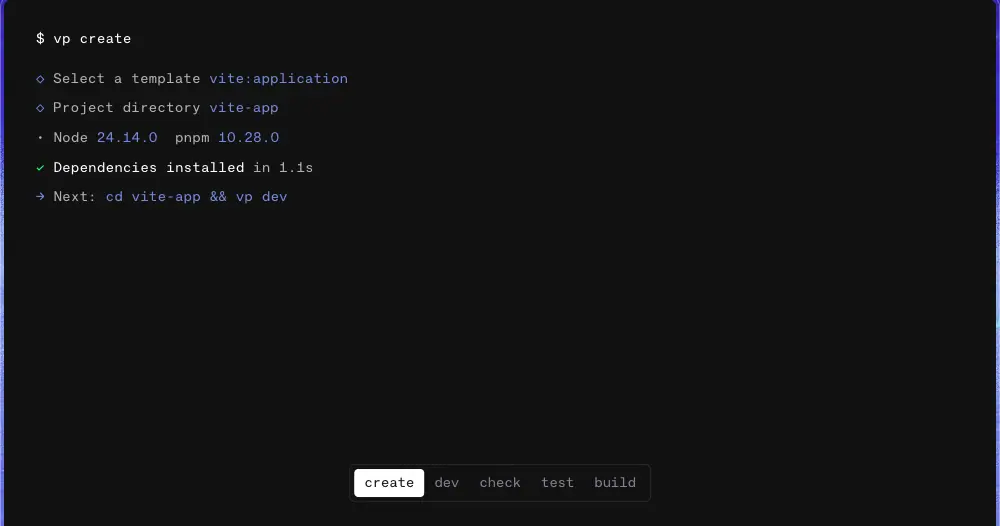
$ vp create |
| Command chip |
KH Teka Mono |
16 / 24 |
400 |
0 |
#110033 |
vp install |
| Install command |
KH Teka Mono |
16 / 22.4 |
400 |
0 |
#ffffff |
curl -fsSL https://vite.plus | bash |

Responsive steps
Measured at 390px wide:
| Role |
1440 |
390 |
| H1 |
60 / 67.2, −3px |
36 / 40, −1.8px |
| H2 |
48 / 48, −1.2px |
30 / 36, −0.75px |
| H4 feature |
30 / 36 |
20 / 28 |
The tracking scales with the size (−0.05em at both widths), so the headline keeps the same density.
Docs scale (VitePress)
| Role |
Family |
Size / line height |
Weight |
Tracking |
| H1 page title |
APK Protocol |
32 / 40 |
600 → 700 file |
−0.64px (−0.02em) |
| H2 |
APK Protocol |
24 / 32 |
600 |
−0.48px (−0.02em) |
| H3 |
APK Protocol |
20 / 28 |
600 |
−0.2px (−0.01em) |
| Body |
Inter |
16 / 28 (1.75) |
400 |
0 |
| Link in body |
Inter |
16 / 28 |
500 |
0, brand colour |
| Inline code |
KH Teka Mono |
14 / 28 |
500 |
brand colour |
| Code block |
KH Teka Mono |
14 / 23.8 (1.7) |
400 |
0 |
| Sidebar group |
APK Protocol |
14 / 24 |
700 |
0 |
| Sidebar item |
Inter / APK Protocol |
14 / 24 |
500 |
0, text-2 |
| Outline item |
Inter |
13 / 28 |
400 |
0 |
Why these choices
- APK Protocol for display. It is a geometric grotesk with flat terminals and tight, squarish counters. At 60px with −0.05em tracking it reads dense and engineered, like a product nameplate. Medium (500), not bold, keeps it calm: the confidence comes from size and tight spacing, not weight.
- Tight tracking only on big type. −0.05em at 60px, −0.025em at 40–48px, 0 at 30px and below. Large type looks loose by default; small type needs its natural spacing to stay readable. This is the standard optical rule, applied cleanly.
- Line height 1.0–1.12 on display, 1.5–1.75 on text. Headlines stack as a block; body and docs get room to read (docs at 1.75 because people read them for minutes, not seconds).
- Mono for labels. Uppercase mono eyebrows (
GETTING STARTED, VITE+ DEV & BUILD) look like comments in code. They organise the page without adding another display style.
- Mono in the illustrations. File names on the isometric tiles (
.TS, .VUE, lint, format) use the same mono. Art and UI share a voice.
- Inter for everything readable. It is neutral, free and has excellent hinting at 14–18px. It lets the claims be skimmed fast.
How to pair it yourself
- Display: a geometric or grotesk sans at 500, tracking −0.05em at ≥56px.
- Text: Inter 400 at 16–18, line height 1.5–1.6 (marketing) or 1.75 (docs).
- Mono: one mono at 12–16 for labels, commands and code; uppercase + 0.025em tracking for eyebrows.
- Never use the display face below 14px or the mono for paragraphs.
04 · Layout, grid and spacing
The frame
Every marketing section is a .wrapper:
.wrapper {
  max-width: 90rem;              /* 1440px */
  max-width: calc(100vw - 2rem); /* earlier rule; 90rem wins at ≥1472px */
  margin-inline: auto;
  border-left: 1px solid #e5e4e7;
  border-right: 1px solid #e5e4e7;
  overflow-x: clip;
  position: relative;
}
.wrapper.border-t { border-top: 1px solid #e5e4e7; }
- At 1440 the wrapper is the full viewport (x = 0 to 1440). Content starts at x = 41: 1px rule + 40px padding.
- On the dark band the rule colour switches to
--color-nickel #3b3440.
- At 390 the wrapper has no max-width and fills the screen (
max-width: none, measured width 390).
Ticks
.wrapper--ticks adds two CSS triangles at the top corners of a row:
.wrapper--ticks::before {           /* left tick, points right */
  content: ""; position: absolute; top: -5px; left: 0;
  width: 0; height: 0;
  border-top: 5px solid transparent; border-bottom: 5px solid transparent;
  border-right: 5px solid transparent; border-left: 5px solid #e5e4e7;
}
.wrapper--ticks::after { /* mirror: border-right: 5px solid #e5e4e7; right: 0 */ }
They mark section joins like the registration marks on a drawing. Used on: trusted-stack row, meta-frameworks row, isometric grid row, footer rows.
Row types and their grids
| Row |
Grid |
Column widths at 1440 |
Divider |
| Hero |
single centred column |
672px (sm:w-2xl) |
none |
| Terminal stage |
single, centred window |
992px window |
none |
| Install |
lg:grid-cols-[0.9fr_1.1fr] |
647 / 791 |
divide-x |
| Three-up features |
lg:grid-cols-3 |
≈480 each |
divide-x |
| Trusted stack + speed |
2 columns |
720 / 720 |
divide-x |
| Section intro (dark, light) |
single, centred or left |
max 448px copy |
none |
| Tool tabs |
5 equal tabs |
287–288 each |
white underline on active |
| Tool row |
md:grid-cols-2 |
720 / 720 |
divide-x |
| Frameworks + platforms |
sm:grid-cols-2 |
720 / 720 |
divide-x |
| Isometric grid |
full bleed canvas |
1440 × 652 |
none |
| Open source |
flex row, justify-between |
text 512 / art 369 |
none |
| Final CTA |
centred over image |
672px column |
none |
| Footer |
2 groups at the edges |
— |
ticks |
Why halves. Almost every content row is an exact 50/50 split. The centre rule lines up all the way down the page (rows 5, 6, 8–12, 14), so the page reads as one long two-column sheet. The 0.9/1.1 install row is the one exception: the commands need more width than the copy.
Spacing
The site uses Tailwind v4 with --spacing: .25rem (4px base). Measured steps:
| Use |
Value |
Token |
| Cell padding (all split rows) |
40px |
p-10 |
| Cell padding at 390 |
20px × 24px |
px-5 py-6 |
| Heading → paragraph |
16–20px gap |
gap-4 / gap-5 |
| Feature row: copy block → "Powered by" |
60px |
gap-15 |
| Hero stack: eyebrow → H1 → lead |
16px |
gap-4 |
| Hero stack: text group → buttons |
40px |
gap-10 |
| Button row gap |
8px ≈ |
gap-2 |
| Terminal stage top padding |
112px |
pt-28 |
| Terminal window padding |
28 × 32px |
py-7 px-8 |
| Section intro height (dark) |
352px fixed |
sm:h-[22rem] |
| Section intro height (light) |
320px fixed |
sm:h-80 |
| Final CTA padding |
120px top and bottom |
py-30 |
| Footer columns → bottom bar |
461px block, 20px bar padding |
py-5 |
Fixed heights, not padding. Section intros use a fixed height (h-70 sm:h-[22rem]) and centre their content with flexbox. This keeps the rhythm exact regardless of how many lines the copy wraps to.
Measures (line length)
| Text |
Max width |
≈ characters per line |
| Lead paragraphs |
448px (max-w-md) |
50–55 |
| Feature body on dark |
400px (max-w-[25rem]) |
50 |
| Install copy |
448px (max-w-[28rem]) |
50 |
| Open-source copy |
512px (max-w-lg) |
60 |
| Hero column |
672px |
headline wraps to 2 lines by design (text-balance) |
| Docs content |
≈688px (VitePress default) |
75 |
Every paragraph uses text-pretty or text-balance, so there are no single-word last lines.
Page height
| Page |
Height at 1440 |
| Home |
8,806px |
| Home at 768 |
10,737px |
| Home at 390 |
11,856px |
| Guide (getting started) |
4,369px |
| Install (package management) |
4,899px |
| Team |
2,527px |
Docs layout
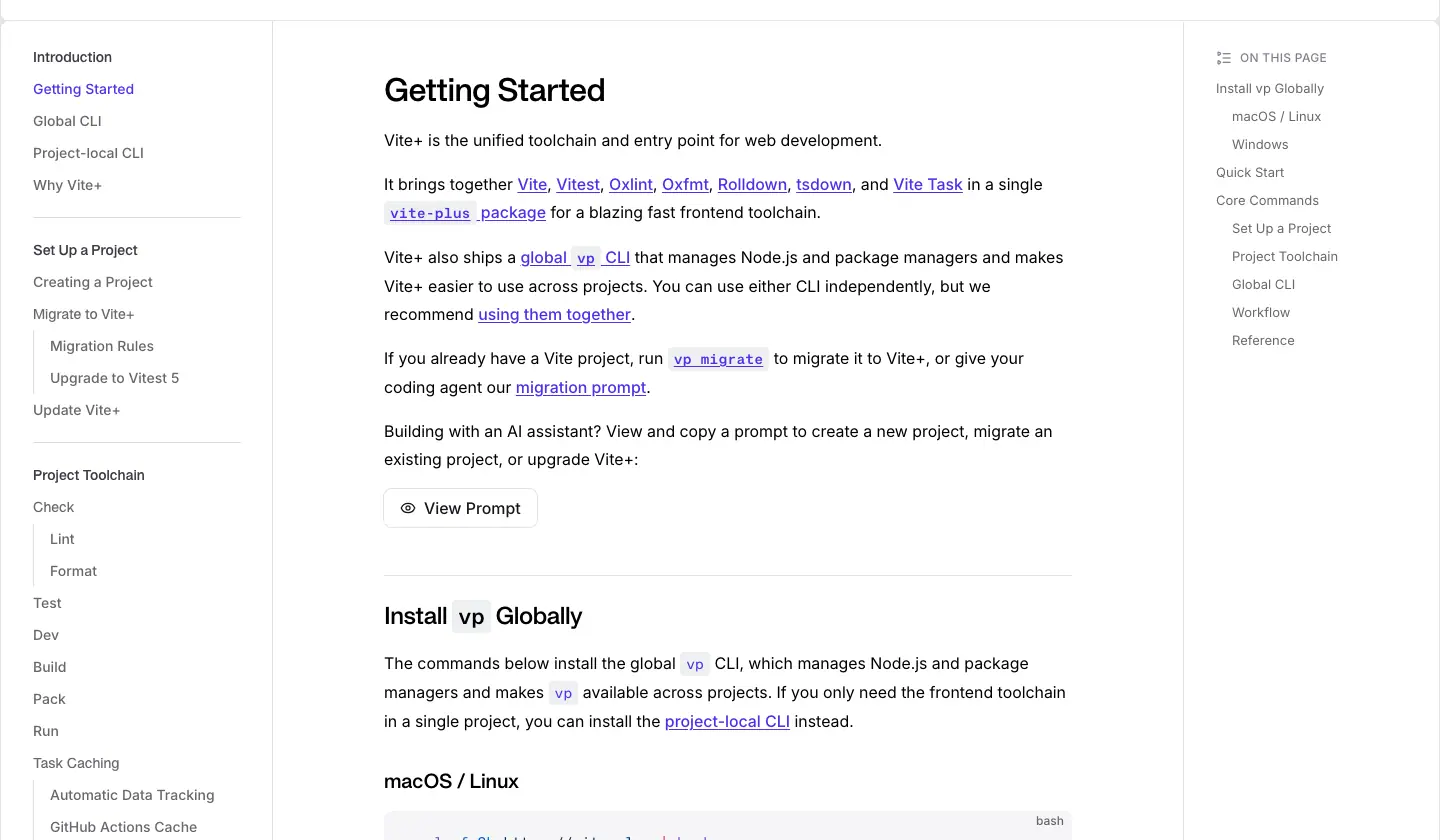
VitePress three-column layout at 1440: sidebar 272px wide (padding 20/32/96), content column 688px starting at x = 384, outline aside 191px at x = 1216 ("On this page"). The header is the same custom 81px .wrapper header as the home page (20px padding + 40px row + 1px rule), fixed to the top on docs (lg:fixed) and scrolling away on the home page. See Docs template.
05 · Heroes
Vite+ has one marketing hero, and it is built in two stacked parts: a centred type hero on white, then a terminal stage that shows the product running. Read together, they say "here is the claim, here is the proof".
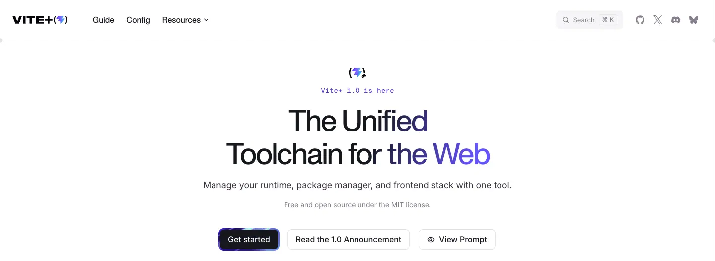
Part 1: the centred type hero (y 0–526)
| Element |
Measured |
Brand mark (⚡+) |
small icon above the eyebrow, centred |
| Eyebrow |
"Vite+ 1.0 is here", KH Teka Mono 14/20, #4f30e8 |
| H1 |
"The Unified / Toolchain for the Web", APK Protocol 500, 60/67.2, −3px, 2 lines, text-balance |
| Lead |
"Manage your runtime, package manager, and frontend stack with one tool." Inter 18/28, #3b3440 |
| Licence note |
"Free and open source under the MIT license." Inter 14/20, #867e8e |
| Buttons |
Get started (primary, texture ring) · Read the 1.0 Announcement (outline) · View Prompt (outline, eye icon) |
| Column |
672px wide, centred; stack gap 16px, gap to buttons 40px |
| Top offset |
H1 top at y = 209 |
The shine. The H1 is filled with a 110° gradient that is near-black except for a 12% indigo (#6254fe) band. background-size: 400% 100% and a 5s ease-in-out forwards animation move the band across the text once. It stops on "the Web", leaving those words indigo.
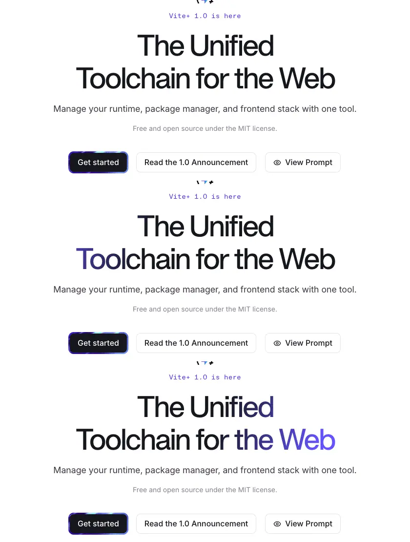
Why this hero works.
- One sentence of category. "The Unified Toolchain for the Web" names the category and the claim in six words. No product jargon, no feature list.
- Two levels of grey under it. The lead is darker (
#3b3440) than the licence note (#867e8e), so the eye reads claim → what it does → why it is safe to try.
- The licence line is in the hero. For an open-source tool, "free and MIT" removes the main objection before the button.
- Three buttons, one loud. Only "Get started" has the animated texture ring. The two outline buttons serve readers who want the announcement or who use AI agents ("View Prompt" shows a copy-paste setup prompt for a coding agent).
- The shine ends on "the Web". The motion has a destination. It underlines the scope (the whole web), then stops, so it does not distract during reading.
Part 2: the terminal stage (y 526–1166)
| Element |
Measured |
| Stage |
full wrapper width, 640px tall (h-[40rem]), bg-wine #140033 under terminal-background.jpg (cover, top) |
| Window |
992 × 527, fill #111111, radius 8 8 0 0, 1px outline rgba(255,255,255,.3), padding 28/32 |
| Placement |
starts 112px from the stage top, runs into the bottom edge (no bottom radius) |
| Content |
typed vp create session: template select, project directory, Node + pnpm versions, "Dependencies installed in 1.1s", next step |
| Tabs |
create · dev · check · test · build, mono 14/20 chips at the window foot; active chip is white with #16171d text |
| Entry |
window slides in with transform 1s cubic-bezier(.16,1,.3,1); tabs follow with .7s same curve, .3s delay |
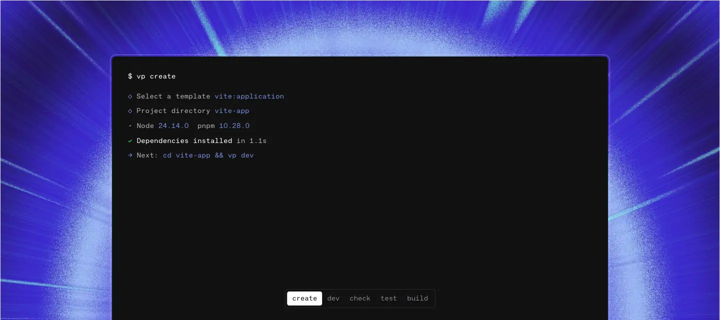
Why a window cut off at the bottom. The open bottom edge makes the terminal feel like it continues below the fold, as if the page itself is the terminal. It also avoids a "framed screenshot" look; it reads as a live surface. The tabs let a reader replay five core commands without scrolling.
Why a texture behind it. The light-streak texture (violet rays from a vanishing point) adds speed and depth to an otherwise flat black box. It is the first of the five textures the page uses, so it sets up the visual language for the tool rows.
Mobile
At 390: H1 36/40, −1.8px; buttons stack; the terminal window fills the width with 16px side padding (px-4). See responsive capture.
Hero recipe
- Mono eyebrow in the brand colour with news ("1.0 is here").
- Two-line display headline, 500 weight, −0.05em,
text-balance.
- Lead in dark grey, licence or trust line in light grey.
- One special primary button, two plain outline buttons.
- Immediately below: the product running, in a window that bleeds off the section edge, on a textured field.
06 · Section types
Every distinct section pattern on viteplus.dev, with a name you can use in a brief, its measurements and why it is there. Section numbers refer to the home page review.
1. Centred type hero
Covered in 05 · Heroes. Home §1.
2. Terminal stage
A product window on a full-bleed texture, bleeding off the bottom edge. Home §2. See 05 · Heroes.
3. Split install row

- Layout.
0.9fr / 1.1fr, divided by a hairline. Left: mono eyebrow GETTING STARTED, H4 "Install vp globally" (30/36), lead (18/28, 448px max), small CI note with a link. Right: two stacked dark command blocks.
- Command block. Near-black panel, mono caption (
MACOS / LINUX, WINDOWS (POWERSHELL)), command in KH Teka Mono 16/22.4 white, ghost "Copy" button (1px rgba(255,255,255,.12) border, radius 6, 14px Inter).
- Why. The first thing after the hero is the install command, because a developer's first question is "how do I try it". Showing both OS commands avoids a tab switch.
4. Three-up feature strip
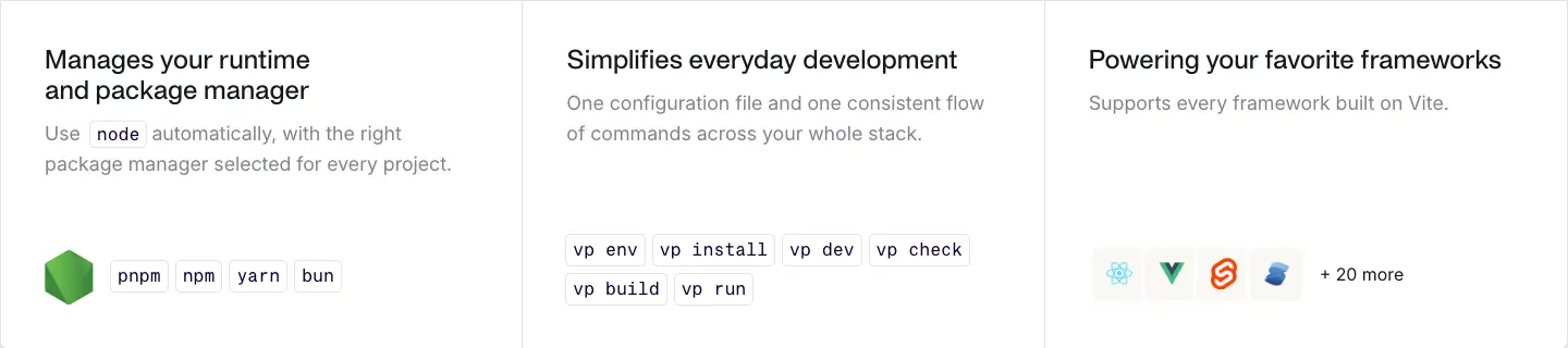
- Layout. Three equal cells, hairline dividers, 40px padding, 320px tall.
- Each cell. APK 24/28 title, Inter 18/28 grey body, then a proof object pinned to the bottom: the Node hexagon +
pnpm npm yarn bun chips; a cloud of vp … command chips; framework icon tiles + "+ 20 more".
- Why. Three short promises (runtime, everyday commands, framework support), each proven by an object, not a sentence. The objects sit at the bottom so the titles align across the row.
5. Stat column with isometric logos ("A trusted stack")
- Layout. Left half of a 50/50 row. Title + body, then three rows: isometric logo tile (96 × 58) · big number (Inter 20/28, 500) + label (16/20 grey) · second number + label, split by a vertical hairline.
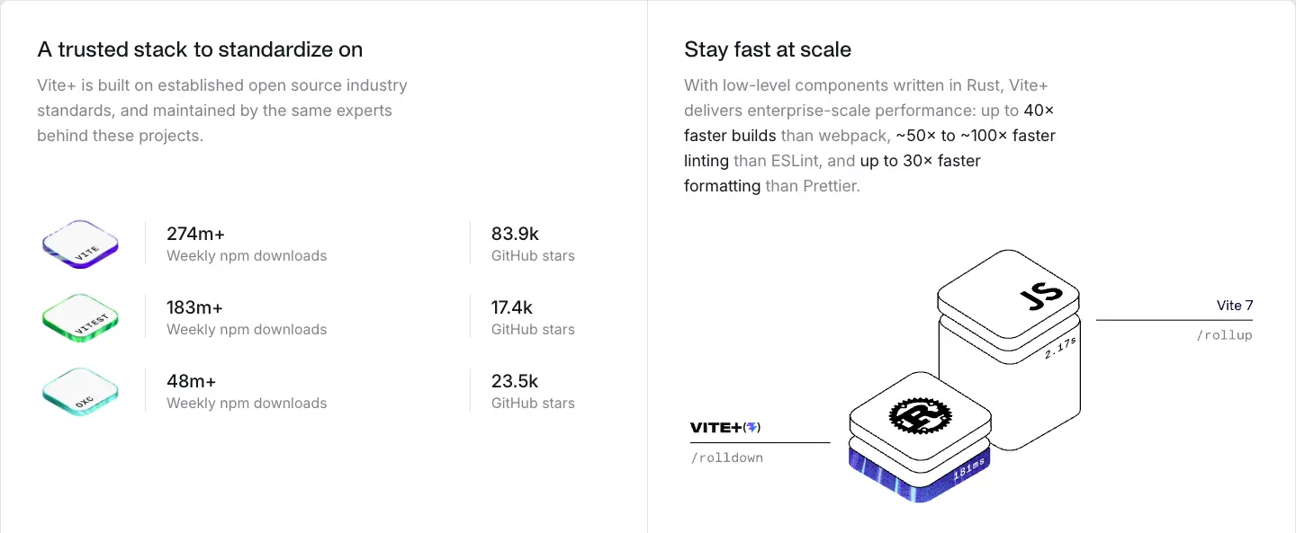
- Numbers. 274m+ / 183m+ / 48m+ weekly npm downloads; 83.9k / 17.4k / 23.5k GitHub stars (Vite, Vitest, Oxc).
- Why. Vite+ is new, but its parts are not. Borrowing the download counts of Vite, Vitest and Oxc turns "new tool" into "standard you already trust".
6. Animated diagram panel ("Stay fast at scale", "Focus on shipping")
- Layout. Right or left half of a split row; title, body with bold numeric claims ("up to 40× faster builds than webpack, ~50× to ~100× faster linting than ESLint"), then a Rive animation (≈639 × 310).
- Why. Speed and time are invisible. A moving isometric drawing (stacked JS boxes vs a Vite+ plate; a timeline of tasks shrinking) makes the claim physical.
7. Checklist card ("Supply chain security")
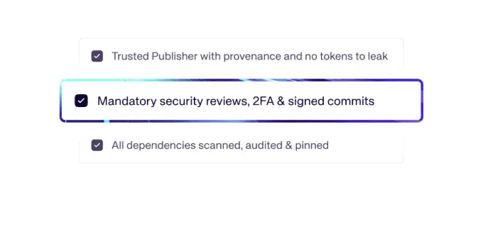
- Three checkbox rows inside thin outlined cards, the middle one raised with an indigo outline and shadow ("Mandatory security reviews, 2FA & signed commits").
- Why. Security buyers scan for specific controls. Checkboxes read as "done", and raising one row adds depth without a second colour.
8. Dark section intro
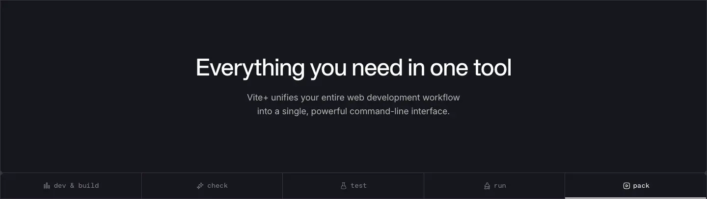
- Fixed 352px tall, centred. H2 APK 48/48 white, −1.2px. Lead 18/28 white 70%, max 448px.
- Why. Marks the switch into the product band; the fixed height gives the band a ceremonial entrance.
9. Tool tab bar
- 5 equal tabs (287px each), KH Teka Mono 14 with small icons:
dev & build · check · test · run · pack. Active tab is white, others grey; a 2px white bar (h-0.5 bg-white) slides under the active tab with transition: all .3s cubic-bezier(0,0,.2,1).
- Why. The tabs work as a table of contents for the five rows below and as scroll anchors. Mono labels match the CLI verbs.
10. Tool row (repeated × 5)
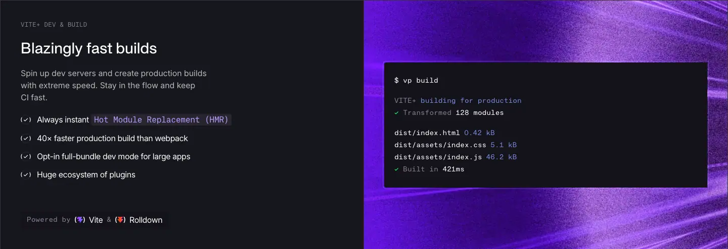
- Layout. 50/50. Left on
#16171d: mono caps eyebrow (VITE+ DEV & BUILD), H4 white 30/36, body white 70% max 400px, four (✓) bullets in white 16/24 −0.4px with inline code chips (bg-nickel/50, coloured text), and a "Powered by (logo) Vite & (logo) Rolldown" line 60px lower.
- Right. Full-bleed texture JPG (
vite.jpg, oxc.jpg, vitest.jpg, viteplus.jpg, rolldown.jpg) with a dark terminal window showing the real command and output. The Vite Task row adds a 4-state switch (Cold Cache · Full Replay · Partial Replay · Full Rebuild).
- Why. Same layout × 5 = easy comparison. Different colour × 5 = each part is memorable. "Powered by" credits the open-source projects, which is both honest and a trust signal.
11. Light statement intro

- Fixed 320px. Left-aligned H3 APK 40/53.3 "Fullstack? No problem." with an 18/28 grey lead.
- Why. A question-answer headline handles an objection ("is this only for SPAs?") in four words.
12. Hub diagram + logo strip + code panel
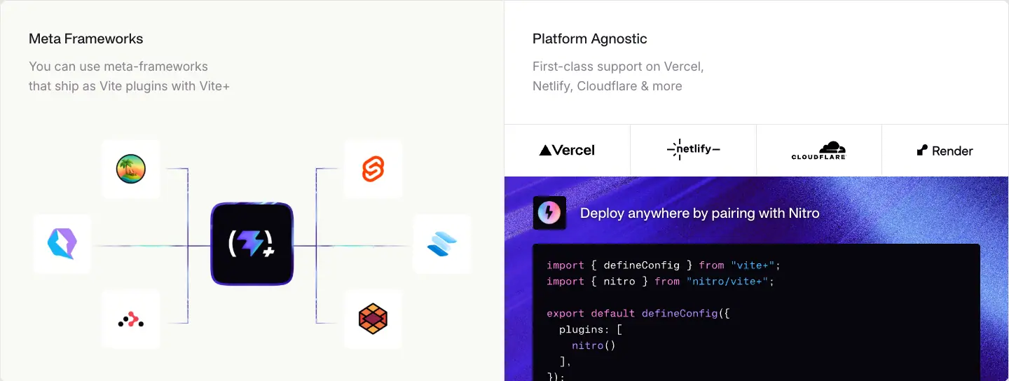
- Left: "Meta Frameworks" on a warm off-white panel, a hub-and-spoke diagram with the Vite+ tile in the centre and six framework icon tiles (icons only, no labels) joined by thin lines in grey with a cyan-to-indigo gradient segment.
- Right: "Platform Agnostic", a 4-cell logo strip (Vercel, Netlify, Cloudflare, Render) with hairline dividers, then a Nitro panel: texture background, icon, "Deploy anywhere by pairing with Nitro", and a
vite.config code sample.
13. Full-bleed isometric animation
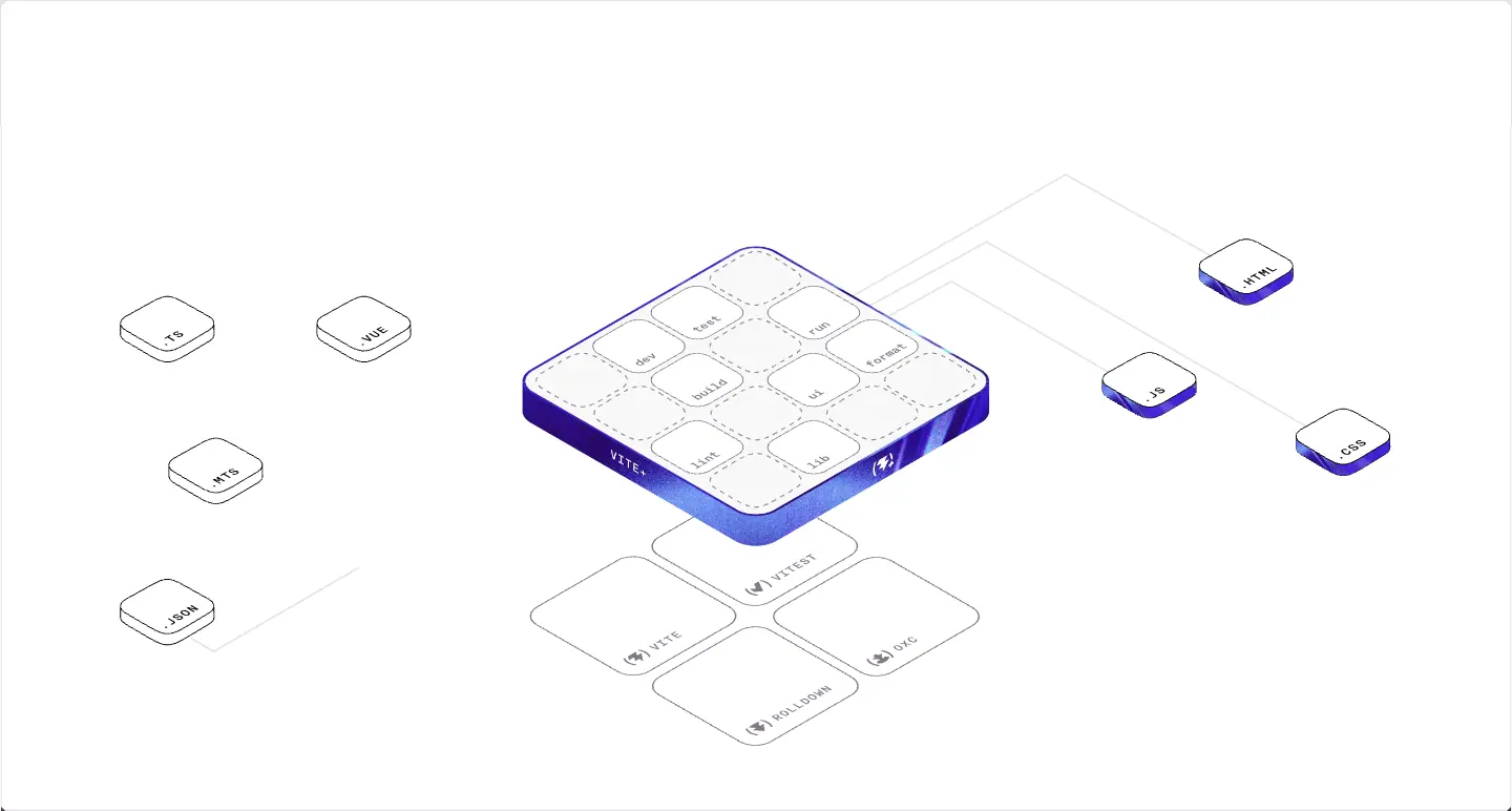
- 1440 × 652 Rive canvas (
vite__masthead.riv, artboard 1280 × 580). File tiles (.TS .VUE .MTS .JSON .HTML .JS .CSS) send lines into a Vite+ board of command keys (dev, test, run, format, build, ui, lint, lib); keys pop up and the tool plate beneath (Vite, Vitest, Rolldown, Oxc) lights in its colour.
- Why. It is the whole product in one picture: many file types in, one toolchain, four engines underneath. No text needed.
14. Open-source band
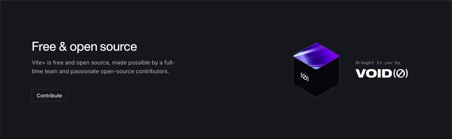
- Dark, flex row. Left: H3 white "Free & open source", 18/28 white-70 copy (max 512), outline "Contribute" button. Right: a textured isometric cube with the VoidZero mark + "Brought to you by VOID(Ø)" lockup (369 × 176 PNG).
- Why. States who stands behind the tool (a funded company) right before the final ask.
15. Final CTA over texture

- 434px tall,
footer-background.jpg cover, centred H2 white 48/48 "Take your team's productivity to the next level with Vite+" with drop-shadow-sm/70, white "Get started" button (button--primary button--white). 120px vertical padding.
- Why. The last screen is pure colour and one action. The drop shadow keeps white type legible over the bright texture.
16. Footer
Two link groups at the far edges, ticks on the rule, a copyright bar. See Header and footer.
Docs patterns
Sidebar, outline, code groups, custom blocks (INFO, WARNING), prev/next. See Docs template.
Team grid
3-column card grid of avatars and social icons. See Team.
What the site does not use
- No bento grid of mixed card sizes. The equivalent is the ruled split grid: every cell is a half or a third, divided by hairlines.
- No customer logo wall, testimonials, pricing table or FAQ.
- No product screenshots of a GUI.
07 · Copywriting and voice
Voice in one line
Short, plain, technical, and a little proud. It speaks like a senior engineer explaining a tool to a peer: claims come with numbers or commands, and nothing is called "revolutionary".
Every headline on the home page
| Level |
Headline |
Pattern |
| H1 |
The Unified Toolchain for the Web |
Category definition |
| H4 |
Install vp globally |
Imperative instruction |
| Card |
Manages your runtime and package manager |
Verb-first benefit |
| Card |
Simplifies everyday development |
Verb-first benefit |
| Card |
Powering your favorite frameworks |
Verb-first benefit |
| Panel |
A trusted stack to standardize on |
Trust claim |
| Panel |
Stay fast at scale |
Outcome |
| Panel |
Focus on shipping, not tooling |
Contrast ("X, not Y") |
| Panel |
Supply chain security |
Plain label |
| H2 |
Everything you need in one tool |
All-in-one claim |
| H4 |
Blazingly fast builds |
Rust-community idiom |
| H4 |
Format, lint, and type-check in one pass |
List of verbs + "one" |
| H4 |
Testing made simple |
Classic benefit |
| H4 |
Vite Task for monorepos and scripts |
Feature name + use |
| H4 |
Library packaging with best practices baked in |
Feature + idiom |
| H3 |
Fullstack? No problem. |
Objection → answer |
| Panel |
Meta Frameworks / Platform Agnostic |
Plain labels |
| H3 |
Free & open source |
Plain fact |
| H2 |
Take your team's productivity to the next level with Vite+ |
Team-level outcome |
What this shows.
- "One" appears four times (one tool, one pass, one command, one configuration file). Unification is the whole pitch, and the copy repeats it.
- Sentence case everywhere in headlines except the H1 (title case). The H1 is a product category, so it gets capitals.
- Headlines are short. Median 5 words. No headline is longer than 11 words.
Proof formulas
| Formula |
Example |
| Multiplier vs a named rival |
"up to 40× faster builds than webpack", "~50× to ~100× faster linting than ESLint", "up to 30× faster formatting than Prettier" |
| Compatibility count |
"750+ ESLint compatible rules", "Jest compatible API", "+ 20 more" frameworks |
| Borrowed scale |
"274m+ Weekly npm downloads", "83.9k GitHub stars" |
| Real output |
"✓ Built in 421ms", "Dependencies installed in 1.1s", "pass: All 42 files are correctly formatted (88ms, 16 threads)" |
| Named engines |
"Powered by Vite & Rolldown", "Powered by Oxc / Oxlint" |
The ~ and "up to" qualifiers are kept, which makes the numbers credible to engineers.
Command as copy
The CLI verbs are the information architecture: vp create, vp dev, vp check, vp test, vp build, vp run, vp pack, vp env, vp install. They appear as tab labels, chips, terminal prompts and keys on the isometric board. Reading the page teaches the tool.
Bullets
Each tool row has 3–4 bullets that start with a noun or adjective, not a verb, and carry one fact each:
- Always instant Hot Module Replacement (HMR)
- 40× faster production build than webpack
- Opt-in full-bundle dev mode for large apps
- Huge ecosystem of plugins
The (✓) glyph in mono parentheses echoes the (⚡+) mark of the logo.
Microcopy
| Place |
Text |
| Announcement |
Vite+ 1.0 is here |
| Primary CTA |
Get started |
| Secondary CTA |
Read the 1.0 Announcement |
| AI CTA |
View Prompt |
| Copy button |
Copy |
| Open-source CTA |
Contribute |
| Credit |
Brought to you by VoidZero |
| Footer |
© 2026 VoidZero Inc. and Vite+ contributors. |
Docs voice
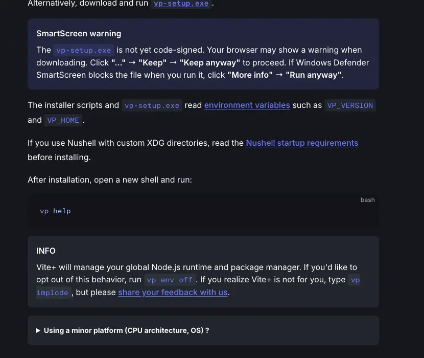
Docs copy is second person and procedural: "Install Vite+ once, open a new terminal session, then run vp help." Warnings are concrete ("vp-setup.exe is not yet code-signed. Your browser may show a warning…"). Every sentence names a command or a file.
Rules to copy
- Name the category in the H1. Put the proof in the next screen.
- Every speed claim names the tool it beats and keeps its qualifier.
- Show commands as text the reader can copy.
- Sentence case for everything but the H1.
- Credit the parts you are built on.
08 · Components
Every component below is measured from the live page. CSS comes from /assets/style.CHL6M4o1.css.
Header (both page types)

.wrapper header, 1440 × 81: 20px vertical padding, 40px row, 1px bottom rule (#e5e4e7 light, #3b3440 dark).- Left: wordmark
VITE+(⚡) (126 × 40 link), then nav links Guide · Config · Resources ▾ in APK Protocol 16/24, padding 8 × 12, 40px tall. Hover: opacity transition 150ms.
- Right: search button (135 × 38, radius 8, fill
#f6f6f7 light / #14121a dark, "Search ⌘K" in Inter 14 grey), on docs a theme switch, then four 36 × 36 social icons (GitHub, X, Discord, Bluesky) in #867e8e, colour transition 500ms.
- On docs the header is fixed; on the home page it scrolls away.
Buttons
| Variant |
Class |
Fill |
Text |
Outline |
Radius |
Padding |
Hover |
| Primary |
.button.button--primary |
::after fill #16171d; ::before texture ring 3px outside |
white, Inter 16 / 500 |
none |
8px inner, 11px ring |
8 × 16 |
scale: 1.05; ring brightness(130%) and grows scale(1.0125, 1.025); fill shrinks scale(.98, .96) |
| Primary white |
+ .button--white |
::after white |
#16171d |
none |
8 |
8 × 16 |
same |
| Outline |
.button |
white |
#16171d |
1px #e5e4e7 |
8 |
8 × 16 |
scale: 1.05 + shadow 0 4px 6px -1px #0000001a, 0 2px 4px -2px #0000001a |
| Outline on dark |
[data-theme=dark] .button |
transparent |
white |
1px #3b3440 |
8 |
8 × 16 |
fills white, text #16171d |
| Small |
.button--sm |
— |
16px |
— |
4 |
6 × 12 |
— |
| Ghost copy |
inline |
transparent |
#867e8e Inter 14 |
1px rgba(255,255,255,.12) |
6 |
8 × 12 |
colour change 150ms |
All buttons: height 38px, display: inline-flex, gap: 8px, user-select: none, transition: all 150ms cubic-bezier(.4,0,.2,1).

The primary ring. ::before is positioned inset: -3px with border-radius: calc(.5rem + 3px), filled with one of five primary-button-background.*.jpg textures at background-size: 150%, and animated by move-background 16s ease-in-out infinite (background-position 40% 40% → 60% 60% → back). The dark ::after sits on top with inset: 0. The visible result is a 3px living texture border. Why: the button carries the same light-streak material as the textures, so the main action looks like part of the brand world, without using a flat brand-colour fill.
Chips
| Chip |
Font |
Fill |
Border |
Radius |
Padding |
Text colour |
| Command chip (light) |
KH Teka Mono 16/24 |
transparent |
1px outline #e5e4e7 |
4 |
2 × 6 |
#110033 |
| Inline code (dark band) |
KH Teka Mono 16/24 |
rgba(59,52,64,.5) |
none |
4 |
2 × 6 |
#b39aff (Vite) or #32f3e9 (Oxc) |
| Docs inline code |
KH Teka Mono 14 / 500 |
rgba(101,117,133,.16) dark / rgba(142,150,170,.14) light |
none |
4 |
3 × 6 |
brand |
| Package-manager chip |
KH Teka Mono 16 |
transparent |
1px outline |
4 |
2 × 6 |
#110033 |
Segmented tabs (terminal)
- Chip tabs under the terminal: KH Teka Mono 14/20, −0.35px, padding 4 × 10, radius 4. Active: white fill,
#16171d text. Inactive: transparent, #867e8e.
- Colour transition 75ms
cubic-bezier(.4,0,.2,1). A 4-state version sits in the Vite Task row (Cold Cache · Full Replay · Partial Replay · Full Rebuild).
Section tab bar

- 5 buttons, each 287 × 52, KH Teka Mono 14, padding 16 × 0, icon + label. Active white, rest
#867e8e. Colour transition 200ms. Sliding 2px white indicator, transition: all 300ms cubic-bezier(0,0,.2,1).
Terminal window
- Fill
#111111, radius 8 (top corners only on the stage; all corners in tool rows), 1px outline rgba(255,255,255,.3), padding 28 × 32 (16 × 20 on mobile).
- Text KH Teka Mono 14/24. Tones: white for commands, muted
#b0b0b3, blue color-mix(in srgb, #3a5ccc 72%, white) for values, #22ff73 for pass/success, grey #867e8e for log lines.
- Lines enter with
opacity 0 → 1 and translateY(.35rem) → 0 over 220ms. Cursor: .62rem × 1.05rem white block, radius 2, terminal-blink .95s step-end infinite.
Command block with copy
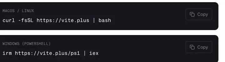
- Dark panel, mono uppercase caption 12/16 grey, command in KH Teka Mono 16/22.4 white,
overflow-x: auto; white-space: nowrap, ghost Copy button right-aligned, 16px gap.
Stat row
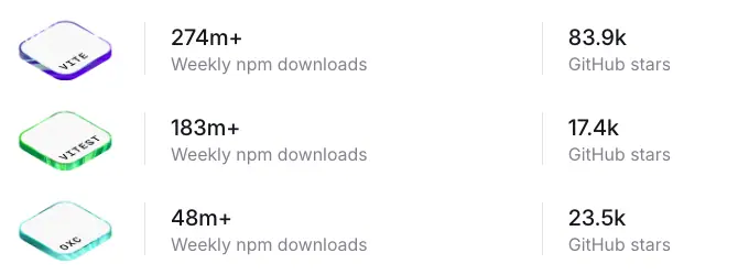
- Isometric logo tile 96 × 58 (
hidden sm:block), number Inter 20/28 500 #16171d, label Inter 16/20 #867e8e, second pair after a vertical hairline.
Feature bullet
(✓) glyph in KH Teka Mono grey, then Inter 16/24 white, −0.4px. Inline code chips sit inside the sentence.
Logo strip

- 4 equal cells (≈180 × 110), monochrome logos (Vercel, Netlify, Cloudflare, Render), hairline dividers, no hover effect.
Icon tile
- 56 × 56, fill
#f9f8f5, radius 12, padding 16, transition: transform 200ms. Holds a full-colour framework logo.

Docs components (VitePress)
| Component |
Measured |
| Code block |
#14121a dark / #f6f6f7 light, radius 8, language label top-right (bash, powershell), KH Teka Mono 14/23.8 |
| Custom block (INFO, details) |
fill rgba(101,117,133,.16) dark, radius 8, 1px transparent border, padding 16 16 8, 14px text, bold uppercase title |
| Warning block ("SmartScreen warning") |
same shape, tinted fill, title in 16/24 600 |
| Prev / next pager |
336 × 66, 1px #2e2e32 border, radius 8, padding 11 16 13; small grey label + brand-colour page name |
| Sidebar |
272px, padding 20 32 96; group titles APK 14/24 700; items 14/24 500 grey; active item brand colour |
| Outline aside |
191px, "ON THIS PAGE" header, items Inter 13/28 grey |
| Search |
135 × 38, radius 8, #14121a / #f6f6f7 |
| Appearance switch |
≈40 × 22 pill (hidden in the 1440 capture; VitePress default), radius 11, 1px #3c3f44 border |
Footer
See Header and footer.
Team card
See Team.
09 · Art direction
Vite+ uses two visual materials and keeps them apart: light-streak textures (emotion, speed, identity per tool) and isometric line drawings (explanation, architecture). A third, smaller system is the logo and mark family shared with the rest of VoidZero.
Material 1: light-streak textures
What they are. Raster JPGs of long-exposure-style light rays: streaks that fan out from a vanishing point, with heavy film grain and a dark core. Each one is tinted to one tool's colour.
| Texture |
File |
Dominant colour |
Used for |
| Terminal stage |
terminal-background.jpg |
violet-blue rays on #140033 |
Hero terminal |
| Vite |
vite.jpg |
violet #863bff → indigo |
Dev & build row |
| Oxc |
oxc.jpg |
cyan/teal (#32f3e9 family) |
Check row |
| Vitest |
vitest.jpg |
green (#22ff73 family) |
Test row |
| Vite+ |
viteplus.jpg |
indigo/blue |
Run row (Vite Task) |
| Rolldown |
rolldown.jpg |
orange (#ff5500 family) |
Pack row |
| Nitro |
nitro.jpg |
indigo |
Nitro deploy panel |
| Footer |
footer-background.jpg |
indigo with a bright centre |
Final CTA |
| Button ring |
primary-button-background.*.jpg (5 files) |
indigo / cyan mix |
Primary button border |
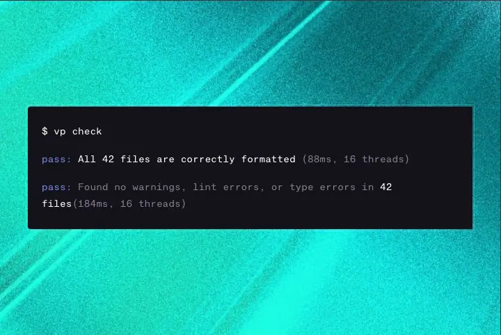
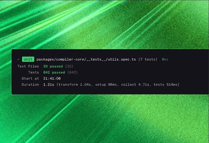
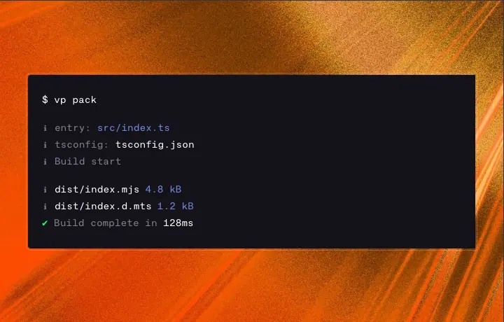
Art-direction rules seen in them.
- Always behind something. No texture is shown alone. Each one frames a terminal, a code panel, a button or a headline.
- Grain is mandatory. Every texture has visible noise. It stops the gradients from banding and gives a physical, photographic feel next to the vector line art.
- Rays point to the content. The vanishing point sits behind or near the terminal window, so the light leads the eye to the code.
- One hue per tool. Colour equals identity. The hue matches each upstream project's own brand (Vitest green, Oxc teal, Rolldown orange).
- Dark core, bright edges. The area behind text stays dark enough for white mono at 14px.
Why. Speed is the main promise. Light streaks are the oldest visual shorthand for speed (warp drive, long-exposure traffic). They also give a CLI product, which has no UI to show, a rich visual identity.
Material 2: isometric line drawings
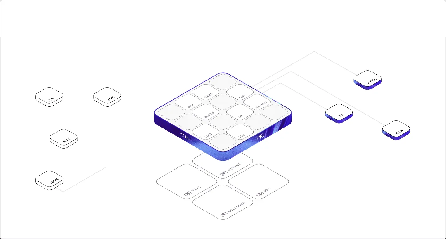
What they are. 30° isometric drawings with:
- 1px grey outlines (
≈#c8c8cc), white or #f9f8f5 faces, rounded-corner plates.
- Dashed outlines for "slots" or empty states.
- One hero solid per drawing, filled with an indigo gradient + grain (the Vite+ board, the active plate). Secondary solids get their tool colour (teal for Oxc).
- Labels in KH Teka Mono, set on the isometric plane (rotated and skewed with the surface).
- Thin connector lines, partly grey and partly in a cyan → indigo gradient where data flows.
Where.
| Drawing |
Format |
Size |
Idea |
| Stat logos (Vite, Vitest, Oxc tiles) |
PNG |
96 × 58 each |
Each project is a physical "block" |
| Stay fast at scale |
Rive (561_x_273_stay_fast_at_scale.riv) |
639 × 310 |
JS box stack vs Vite+ / Rolldown plates, with Vite 7 / rollup labels |
| Focus on shipping |
Rive (514_x_246_focus_on_shipping_v2.riv) |
638 × 305 |
Engineering time: setup, CI, upgrades shrink beside the Vite+ block |
| Supply chain security |
PNG (productivity-security.png) |
639 × 280 |
Stacked checklist cards in perspective |
| Meta-frameworks hub |
PNG (meta-frameworks.png) |
638 × 310 |
Hub-and-spoke diagram, flat with isometric-style tiles |
| Masthead |
Rive (1280_x_580_vite__masthead.riv) |
1440 × 652 |
Files flow into the Vite+ board; commands light; engines below |
| VoidZero cube |
PNG (vite-by-voidzero.png) |
369 × 176 |
Textured isometric cube with the Ø mark |
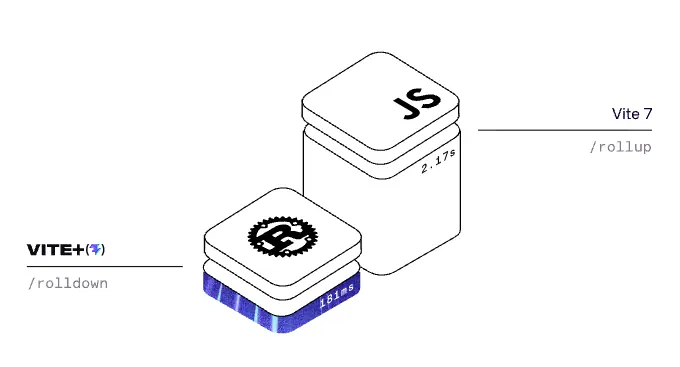
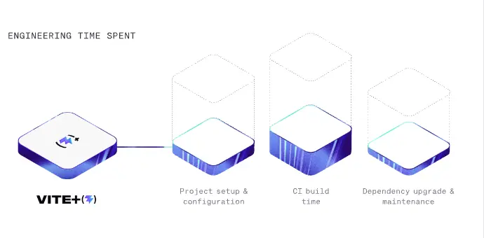
Why isometric. It shows layers. "Vite+ sits on top of Vite, Vitest, Rolldown and Oxc" is a stacking idea, and isometric is the clearest way to draw a stack. It also borrows the look of cloud-architecture diagrams that the audience reads at work, so it feels like documentation, not decoration.
Why mostly grey line. The textures already bring colour. If the diagrams were colourful too, the page would be noisy. Grey line + one indigo solid keeps the diagrams calm and makes the hero object obvious.
Material 3: logo, wordmark and mark
- Wordmark.
VITE+ in heavy, wide uppercase sans, followed by the mark (⚡) in parentheses. In the nav the image is 16px tall (h-4, ≈110px wide) inside a 126 × 40 link. Two files, viteplus-dark.svg and viteplus-light.svg, swap with the theme.
- Mark. A lightning bolt with a small plus, inside round brackets:
(⚡+). The brackets come from the VoidZero family mark (Ø). The bolt is Vite's lightning bolt. Bracket + symbol is a family system: every VoidZero project mark is a symbol inside brackets (seen in "Powered by (⚡) Vite & (◎) Rolldown", "(⊕) Oxc", "(✓) Vitest").
- Colour. Black wordmark with an indigo-gradient bolt on light; white wordmark on dark.
- Bullet glyph. Feature bullets use
(✓) in mono, a deliberate echo of the bracket mark.

Why brackets. They read as code (function call, tuple) and as a container. One shape unifies five separate open-source brands under one company.
Logos of others
- Partner and framework logos appear in their own colours only inside small neutral tiles (56 × 56,
#f9f8f5, radius 12).
- Platform logos (Vercel, Netlify, Cloudflare, Render) are forced monochrome black in a hairline strip.
- Why. Full-colour third-party logos are kept small and boxed so they do not compete with the textures.
Photography
None on the marketing page. The only photos are member avatars on the Team page (GitHub avatars, circular).
Iconography
- UI icons are thin (≈1.5px) line icons at 16px: eye (View Prompt), copy, chevron, search, tab icons, social icons.
- Social icons are filled brand glyphs at 20px in
#867e8e.
Rules to copy
- Pick one emotional material (a texture) and one explanatory material (a line drawing). Never mix them in the same object.
- Give each sub-product a hue and never use that hue elsewhere.
- Put grain on every gradient.
- Draw systems in isometric, with one solid hero object per drawing.
- Set labels inside art in the same mono as the UI.
10 · Brand assets and graphics inventory
Every distinct graphic on viteplus.dev, cropped from the 1440px screenshot, with what it is made of and how to recreate the same kind of asset. File names in code are the production asset names from the page (data/home.probe.json → media, bgimgs).
Inventory
| # |
Asset |
Crop |
Production file |
Type |
How it is made |
How to recreate |
| 1 |
Wordmark |
|
viteplus-dark.svg / viteplus-light.svg (<img>, 16px tall h-4, ≈110px wide; swapped with dark:hidden) |
Vector |
Wide heavy caps + bracketed bolt |
Set the name in a wide grotesk at 800–900, add the mark in brackets |
| 2 |
Hero mark + eyebrow |
|
image above the eyebrow |
Vector |
(⚡+) mark with indigo gradient |
Gradient #4f30e8 → #6b77f8 on the symbol only |
| 3 |
Shine headline |
|
CSS |
Type effect |
background-clip: text, 400% gradient, 5s sweep |
See 13 · Build recipe |
| 4 |
Primary button ring |
 |
primary-button-background.*.jpg (5 variants) |
Raster in CSS |
Texture under a dark fill, 3px visible |
Any light-streak JPG at background-size:150% with a slow position loop |
| 5 |
Terminal stage texture |
 |
terminal-background.jpg on #140033 |
Raster |
Radial light rays, film grain |
Render rays in Blender/After Effects (radial blur on noise), or a radial conic-gradient + SVG noise overlay; export JPG |
| 6 |
Terminal window |
|
HTML |
UI |
#111, 1px white-30 outline, mono text |
HTML, not an image, so it stays sharp and copyable |
| 7 |
Tool textures × 5 |
|
vite.jpg, oxc.jpg, vitest.jpg, viteplus.jpg, rolldown.jpg |
Raster |
Same ray system, re-tinted per tool |
Make one master render; recolour with a gradient map per hue |
| 8 |
Nitro panel |
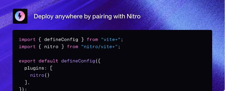 |
nitro.jpg + nitro.svg (code art) |
Raster + vector |
Texture with code sample on top |
Same as 7 |
| 9 |
Isometric project tiles |
|
vite.png, vitest.png, oxc.png |
Raster (from 3D/vector) |
Rounded isometric plate, tool-colour side, logo on top |
Draw in Figma with an isometric grid plugin, or model in Spline/Blender, render at 2× |
| 10 |
Speed animation |
|
561_x_273_stay_fast_at_scale.riv |
Rive |
Line art + grain-filled solids, looping |
Draw in Rive; keep strokes 1px, animate position and opacity only |
| 11 |
Time animation |
|
514_x_246_focus_on_shipping_v2.riv |
Rive |
Blocks shrink along a timeline |
Same |
| 12 |
Security checklist |
|
productivity-security.png |
Raster |
Three outlined checkbox cards, one raised with indigo outline |
Build in Figma; export PNG at 2× |
| 13 |
Meta-frameworks hub |
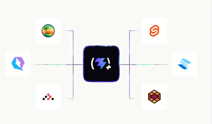 |
meta-frameworks.png |
Raster |
Centre tile + 6 logo tiles + connector lines with gradient segment |
Figma; connectors 1px grey with a 2-stop cyan→indigo segment |
| 14 |
Platform logo strip |
|
inline SVG logos |
Vector |
Monochrome logos in hairline cells |
Force logos to #16171d |
| 15 |
Framework icon tiles |
|
inline |
Vector |
56px tiles, #f9f8f5, radius 12 |
— |
| 16 |
Node + PM chips |
 |
data:image/png node hexagon |
Raster + HTML |
Logo + outline chips |
— |
| 17 |
Command chips |
|
HTML |
UI |
Outline mono chips |
— |
| 18 |
Isometric masthead |
|
1280_x_580_vite__masthead.riv |
Rive |
Full system diagram, animated |
Rive state machine; loop through commands |
| 19 |
VoidZero cube + lockup |
 |
vite-by-voidzero.png |
Raster |
Textured isometric cube + "Brought to you by VOID(Ø)" |
3D cube with the texture as material |
| 20 |
Final CTA field |
 |
footer-background.jpg |
Raster |
Indigo ray burst with a bright centre |
Same ray system, centred vanishing point |
| 21 |
Tick marks |
|
CSS |
CSS triangles |
5px border triangles |
See 04 · Layout |
| 22 |
Social card |
— |
og.jpg |
Raster |
Open Graph image |
Not captured |
Motion assets
| Asset |
Frames |
| Masthead Rive loop |
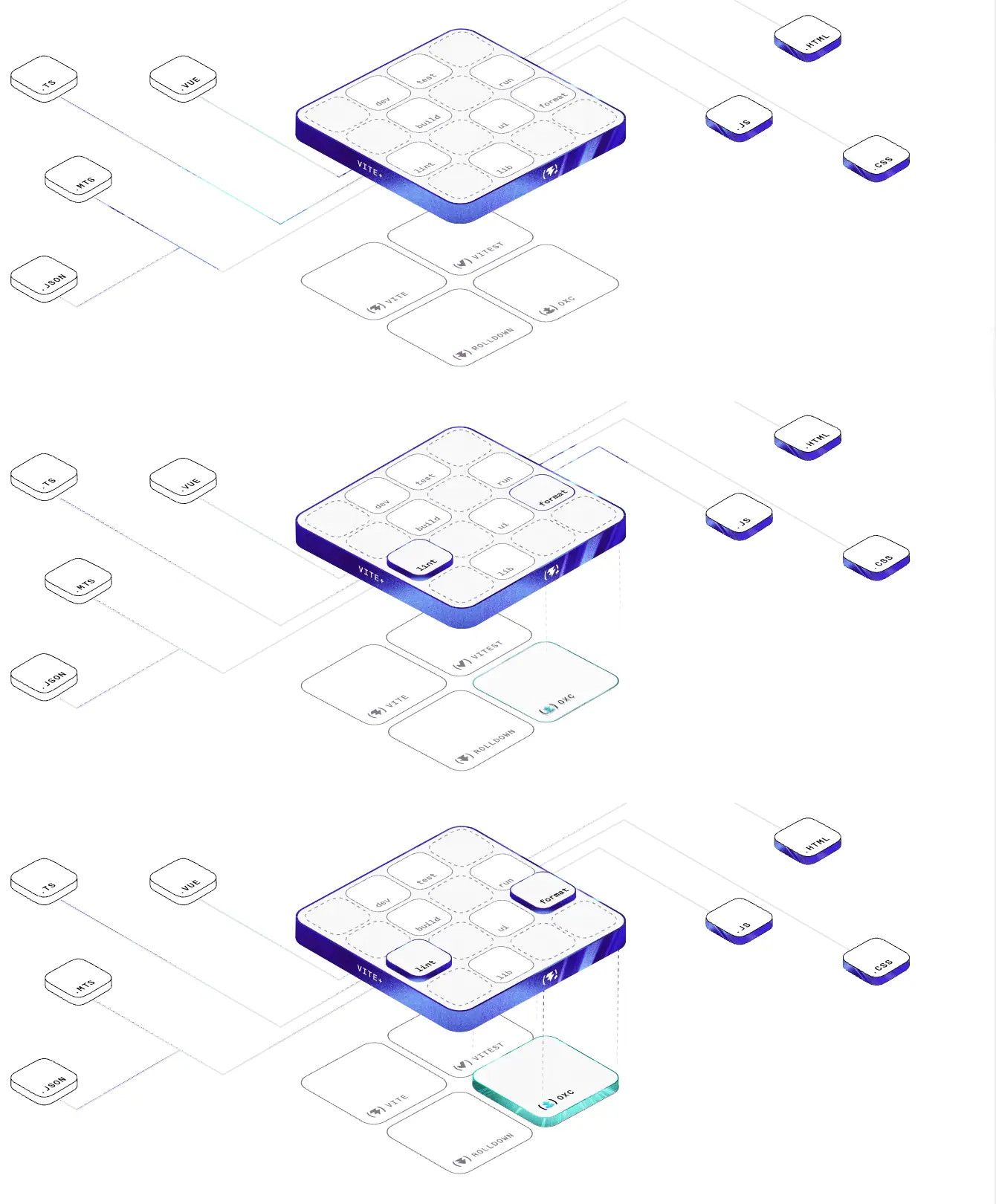 |
| Speed Rive loop |
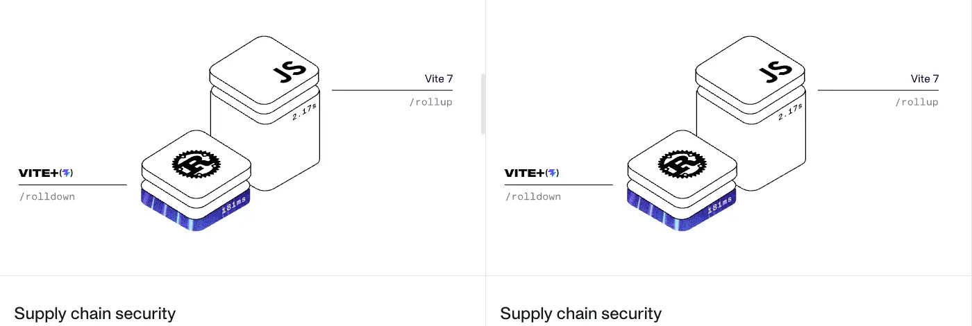 |
| Shine sweep |
|
Asset production notes
- Format choices. Textures are JPG (photographic, grainy, no transparency needed). Diagrams that animate are Rive (
rive.wasm is loaded once, ≈ one runtime for three files). Static diagrams are PNG. UI (terminals, chips, code) is HTML, so it is selectable, accessible and crisp.
- One master, many tints. All nine textures share the same ray structure. That is the cheapest way to make a family: one render, recoloured.
- Grain everywhere. Even the indigo solids in the isometric art carry grain, so line art and textures look like one world.
- No stock imagery, no people, no 3D characters.
Checklist to build an asset kit like this
- Wordmark + bracket mark, light and dark.
- One light-streak master texture; 1 tint per product area + 1 for CTAs.
- An isometric tile template (plate, side colour, top logo) for every product/partner.
- A line-art style sheet: stroke 1px, grey
#c8c8cc, dashed for empty, one gradient solid per scene.
- A mono label style for text inside art.
- Rive (or Lottie) for 2–3 hero diagrams; PNG for the rest.
11 · Motion and interaction
Sources: getComputedStyle over every element on the home page (data/home.probe.json → transitions, animations), the @keyframes in the stylesheet, hover tests in the browser, and frame captures.
Motion tokens
--default-transition-duration: .15s;
--default-transition-timing-function: cubic-bezier(.4, 0, .2, 1); /* Tailwind ease-in-out */
--ease-out: cubic-bezier(0, 0, .2, 1);
--ease-in-out: cubic-bezier(.4, 0, .2, 1);
--ease-smooth: cubic-bezier(.25, .8, .4, 1);
--ease-fast: cubic-bezier(.45, .15, .6, .9);
--fav-out-dur: .16s;
--del-dur: .15s;
Every transition on the home page
| Count |
Property |
Duration |
Easing |
Delay |
Where |
| 5 |
all |
150ms |
(.4,0,.2,1) |
0 |
Outline buttons, search |
| 11 |
opacity |
150ms |
(.4,0,.2,1) |
0 |
Nav links (hover fades) |
| 8 |
color |
500ms |
ease |
0 |
Social icons |
| 1 |
transform, scale |
150ms |
(.4,0,.2,1) |
0 |
Primary button |
| 1 |
transform |
1000ms |
(.16,1,.3,1) |
0 |
Terminal window entrance |
| 1 |
transform |
700ms |
(.16,1,.3,1) |
300ms |
Terminal tab bar entrance |
| 9 |
colours |
75ms |
(.4,0,.2,1) |
0 |
Terminal chip tabs |
| 4 |
colours |
150ms |
(.4,0,.2,1) |
0 |
Checklist card, chip buttons |
| 4 |
transform |
200ms |
ease |
0 |
Framework icon tiles |
| 1 |
all |
300ms |
(0,0,.2,1) |
0 |
Tab underline indicator |
| 5 |
colours |
200ms |
(.4,0,.2,1) |
0 |
Section tab labels |
Pseudo-element transitions (from CSS, not visible to the element scan): primary button ring all .2s ease-in-out, primary fill all .3s ease-in-out.
Keyframe animations
| Name |
Duration / easing / count |
What it does |
shine |
5s ease-in-out, once, forwards |
Moves an indigo band across the H1 (background-position 100% → 35%) |
move-background |
16s ease-in-out infinite |
Drifts the primary button's texture ring (40% 40% → 60% 60% → back) |
terminal-blink |
.95s step-end infinite |
Hard on/off block cursor |
fadeIn / fade-in |
— |
Opacity 0 → 1 (Vue component entrances) |
pulse |
— |
Opacity .3 ↔ .6 (loading placeholders) |
shimmer-text, slide-down |
2.5s linear / .3s ease-out |
DocSearch "Ask AI" states, not on the page |
Terminal lines use a Vue transition: .terminal-line-enter-active { transition: opacity .22s, transform .22s }, from opacity:0; transform: translateY(.35rem).
Choreography, top to bottom
- Load. The H1 shine starts at once and runs 5s; it ends with "the Web" in indigo.
- Terminal stage. The window rises on a 1s expo-out curve
(.16,1,.3,1), the tab bar follows 300ms later over 700ms. Lines type in, 220ms each, with a blinking cursor.
- Rive diagrams. "Stay fast at scale", "Focus on shipping" and the masthead play continuous loops (see frame strips below). Their timing lives inside the
.riv files and cannot be read from CSS.
- Tabs. Clicking a tool tab moves the 2px underline in 300ms ease-out.
- No scroll-triggered reveals were found: sections do not fade or slide in as you scroll (no
opacity:0 sections, no IntersectionObserver classes in the scan).
The masthead loop, observed: file tiles send a cyan→indigo pulse along their connector; a command key (lint, then format) pops up from the board; the matching engine plate below (Oxc, in teal) lifts and fills with colour. Then the next command plays.
Hover states (tested)
| Element |
Hover result |
| Primary button |
scale: 1.05 (verified: computed scale = 1.05 while hovered); ring brightens 130% and expands; dark fill shrinks to 98% × 96%, so more ring shows |
| Outline button |
scale: 1.05 + small shadow |
| Outline on dark |
fills white, text turns #16171d |
| Nav link |
opacity drop over 150ms |
| Social icon |
colour shifts over 500ms |
| Icon tile |
transform over 200ms (≈ lift) |
Reduced motion
@media (prefers-reduced-motion: reduce) {
  *, :before, :after {
    background-attachment: initial !important;
    scroll-behavior: auto !important;
    transition-duration: 0s !important;
    transition-delay: 0s !important;
    animation-duration: 1ms !important;
    animation-iteration-count: 1 !important;
    animation-delay: -1ms !important;
  }
}
This is a global kill switch: every CSS animation jumps to its end state (the shine ends on "the Web"; the button ring stops). Whether the Rive loops respect the setting was not tested.
Why this motion
- Fast UI, slow brand. UI feedback is 75–200ms (chips 75ms, buttons 150ms). Brand moments are long: 1s entrance, 5s shine, 16s ring drift. Tools must feel instant; the brand can breathe.
- Expo-out for entrances.
(.16,1,.3,1) moves most of the distance in the first 200ms and then settles, so the terminal feels present at once but lands softly.
- Motion explains, it does not decorate. The only continuous motion (Rive) is the product diagram itself. There are no parallax layers and no scroll reveals.
step-end cursor. A real terminal cursor does not fade, it blinks hard. Matching that detail is what makes the terminal feel real.
What could not be measured
- Rive frame timings and easing (inside
.riv).
- Whether Rive pauses off-screen or under reduced motion.
- The "View Prompt" dialog and search modal open/close motion (not opened).
12 · Glossary
Words you need to brief, design or build a page like viteplus.dev. Each term has a short definition and where it shows up on the site.
| Term |
Meaning |
On viteplus.dev |
| Ruled frame |
A content column bordered by thin vertical lines, with horizontal rules between rows |
.wrapper, 1440px, #e5e4e7 rules |
| Hairline |
A 1px line used as a divider |
All row and column dividers |
| Tick / registration mark |
A small mark where two rules meet, borrowed from print and technical drawing |
5px CSS triangles on .wrapper--ticks |
| Split row |
A row cut into equal columns by a divider |
50/50 rows, divide-x |
| Eyebrow |
A small label above a headline |
GETTING STARTED, mono caps 12px |
| Display face |
A typeface designed for large sizes |
APK Protocol |
| Tracking |
Even letter spacing across a word or line (CSS letter-spacing) |
−0.05em on the H1 |
| Leading |
Line height |
1.12 on the H1, 1.75 in docs |
| Measure |
Line length of a paragraph |
448px ≈ 50–55 characters |
text-balance / text-pretty |
CSS wrapping that evens out lines / avoids a lone last word |
Every headline / paragraph |
| Gradient text / text clip |
A gradient shown through the letter shapes (background-clip: text) |
Shine headline |
| Shine / sheen sweep |
A bright band moving across text or a surface |
5s H1 animation |
| Light-streak texture |
A raster of light rays, like long-exposure photography |
Tool row backgrounds |
| Film grain / noise |
Fine random speckle on an image |
On every texture and gradient solid |
| Gradient map |
Recolouring an image by mapping its brightness to a colour ramp |
How one texture becomes five tints |
| Isometric |
3D drawing where the three axes are 120° apart and nothing shrinks with distance |
All diagrams |
| Line art |
Illustration made only of strokes |
Grey 1px isometric drawings |
| Hero object |
The one emphasised element in an illustration |
Indigo Vite+ board |
| Hub-and-spoke diagram |
One centre node linked to many outer nodes |
Meta-frameworks panel |
| Lockup |
A fixed arrangement of logo and text |
"Brought to you by VOID(Ø)" |
| Wordmark |
A logo made of the name set as type |
VITE+ |
| Mark / logomark |
The symbol part of a logo |
(⚡+) |
| Brand architecture (endorsed) |
Sub-brands that share a parent's visual signature |
Bracketed marks across Vite, Vitest, Rolldown, Oxc |
| Terminal stage |
A product shown as a terminal window on a styled backdrop |
Hero part 2 |
| Bleed |
An element running off the edge of its container |
Terminal window cut off at the bottom |
| Segmented control / chip tabs |
A row of tab buttons that look like chips |
create · dev · check |
| Command chip |
Inline code styled as a small outlined tag |
vp install |
| Ghost button |
A button with only a border |
Copy |
| Outline button |
White button with a 1px outline |
Read the 1.0 Announcement |
| Texture ring / animated border |
A border filled with a moving image |
Primary "Get started" |
| Social proof (borrowed) |
Trust numbers taken from parts or partners |
274m+ weekly npm downloads |
| Proof point |
A specific, checkable claim |
"40× faster builds than webpack" |
| Objection handling |
Copy that answers a doubt |
"Fullstack? No problem." |
| Rive |
A runtime and editor for interactive vector animation (.riv files) |
3 diagrams |
| Expo-out easing |
A curve that starts very fast and settles slowly |
cubic-bezier(.16,1,.3,1) |
step-end |
A timing function that jumps instead of easing |
Cursor blink |
| Reduced motion |
The OS setting that asks sites to cut animation |
Global CSS override |
| VitePress |
Vue/Vite static site generator for docs |
All 82 docs pages |
| Custom block / callout / admonition |
A boxed note in docs (INFO, TIP, WARNING) |
Docs |
| Pager |
Previous / next links at the end of a doc |
Docs footer |
| Outline / TOC aside |
"On this page" list of headings |
Docs right column |
| Design tokens |
Named variables for colour, type and spacing |
--color-primary, --font-heading |
13 · Build recipe
Paste-ready CSS that reproduces the Vite+ look with your own content. Values are the measured ones; font names point to free substitutes where the originals are commercial (see 03 · Typography). Use your own textures and art; do not reuse Vite+'s files.
Tokens
:root {
  /* colour */
  --c-ink: #16171d;          /* headline text, dark band, button fill */
  --c-paper: #ffffff;
  --c-lead: #3b3440;         /* hero lead */
  --c-muted: #867e8e;        /* body grey (3.9:1; use #6e6776 for AA) */
  --c-rule: #e5e4e7;         /* hairlines on light */
  --c-rule-dark: #3b3440;    /* hairlines on dark */
  --c-warm: #f9f8f5;         /* warm panel, icon tiles */
  --c-brand: #4f30e8;        /* brand on light, 7.2:1 */
  --c-brand-dark: #6b77f8;   /* brand on dark, 4.8:1 */
  --c-shine: #6254fe;
  --c-term: #111111;
  --c-wine: #140033;
  --c-aqua: #32f3e9; --c-zest: #22ff73; --c-fire: #ff5500; --c-vite: #b39aff;

  /* type */
  --f-display: "Geist", "APK Protocol", sans-serif;
  --f-text: "Inter", sans-serif;
  --f-mono: "Geist Mono", "KH Teka Mono", monospace;

  /* space and shape */
  --cell: 40px;              /* cell padding */
  --frame: 1440px;
  --r-sm: 4px; --r-md: 6px; --r-lg: 8px; --r-xl: 12px;

  /* motion */
  --ease: cubic-bezier(.4, 0, .2, 1);
  --ease-out: cubic-bezier(0, 0, .2, 1);
  --ease-expo: cubic-bezier(.16, 1, .3, 1);
  --t-fast: 75ms; --t-ui: 150ms; --t-tab: 300ms;
}
body { margin: 0; background: var(--c-paper); color: var(--c-ink); font: 400 16px/1.5 var(--f-text); }
Type scale
.h1 { font: 500 60px/1.12 var(--f-display); letter-spacing: -0.05em; text-wrap: balance; }
.h2 { font: 500 48px/1 var(--f-display); letter-spacing: -0.025em; }
.h3 { font: 500 40px/1.33 var(--f-display); letter-spacing: -0.025em; }
.h4 { font: 500 30px/1.2 var(--f-display); }
.lead { font: 400 18px/28px var(--f-text); color: var(--c-muted); max-width: 28rem; text-wrap: pretty; }
.eyebrow { font: 400 12px/16px var(--f-mono); letter-spacing: .025em; text-transform: uppercase; color: var(--c-muted); }
@media (max-width: 640px) {
  .h1 { font-size: 36px; line-height: 40px; }
  .h2 { font-size: 30px; line-height: 36px; }
  .h4 { font-size: 20px; line-height: 28px; }
}
Ruled frame with ticks
.frame { max-width: var(--frame); margin-inline: auto; border-inline: 1px solid var(--c-rule); position: relative; overflow-x: clip; }
.frame + .frame { border-top: 1px solid var(--c-rule); }
.frame.ticks::before, .frame.ticks::after {
  content: ""; position: absolute; top: -5px; width: 0; height: 0;
  border: 5px solid transparent;
}
.frame.ticks::before { left: 0;  border-left-color: var(--c-rule); }
.frame.ticks::after  { right: 0; border-right-color: var(--c-rule); }
.split { display: grid; grid-template-columns: 1fr 1fr; }
.split > * + * { border-left: 1px solid var(--c-rule); }
.cell { padding: var(--cell); display: flex; flex-direction: column; gap: 16px; }
.dark { background: var(--c-ink); color: #fff; --c-rule: var(--c-rule-dark); }
Shine headline
.shine {
  background: linear-gradient(110deg, var(--c-ink) 0 40%, var(--c-shine) 48% 52%, var(--c-ink) 60% 100%);
  background-size: 400% 100%; background-position: 100% 0;
  -webkit-background-clip: text; background-clip: text;
  -webkit-text-fill-color: transparent;
  animation: shine 5s ease-in-out forwards;
}
@keyframes shine { to { background-position: 35% 0; } }
Buttons
.btn { display: inline-flex; align-items: center; gap: 8px; height: 38px; padding: 8px 16px;
  border-radius: var(--r-lg); font: 500 16px/1.4 var(--f-text); background: #fff; color: var(--c-ink);
  outline: 1px solid var(--c-rule); transition: all var(--t-ui) var(--ease); user-select: none; }
.btn:hover { scale: 1.05; box-shadow: 0 4px 6px -1px #0000001a, 0 2px 4px -2px #0000001a; }

.btn-primary { position: relative; color: #fff; background: transparent; outline: none; isolation: isolate; }
.btn-primary::before { content: ""; position: absolute; inset: -3px; z-index: -2;
  border-radius: calc(var(--r-lg) + 3px);
  background: #ccc url(/your-texture.jpg) 50% / 150% 150%;
  transition: all .2s ease-in-out; animation: drift 16s ease-in-out infinite; }
.btn-primary::after { content: ""; position: absolute; inset: 0; z-index: -1;
  border-radius: var(--r-lg); background: var(--c-ink); transition: all .3s ease-in-out; }
.btn-primary:hover::before { filter: brightness(130%); transform: scale(1.0125, 1.025); }
.btn-primary:hover::after { transform: scale(.98, .96); }
@keyframes drift { 0%, 100% { background-position: 40% 40%; } 50% { background-position: 60% 60%; } }
Chips and code
.chip { font: 400 16px/24px var(--f-mono); padding: 2px 6px; border-radius: var(--r-sm);
  outline: 1px solid var(--c-rule); color: #110033; }
.dark .chip { outline: none; background: rgb(59 52 64 / .5); color: var(--c-aqua); }
.tabs button { font: 400 14px/20px var(--f-mono); letter-spacing: -0.025em; padding: 4px 10px;
  border-radius: var(--r-sm); color: var(--c-muted); background: transparent;
  transition: color var(--t-fast) var(--ease), background-color var(--t-fast) var(--ease); }
.tabs button[aria-selected="true"] { background: #fff; color: var(--c-ink); }
Terminal window
.term { background: var(--c-term); border-radius: var(--r-lg) var(--r-lg) 0 0;
  outline: 1px solid rgb(255 255 255 / .3); padding: 28px 32px;
  font: 400 14px/24px var(--f-mono); color: #fff; }
.term .muted { color: #b0b0b3; } .term .ok { color: var(--c-zest); }
.term .val { color: color-mix(in srgb, #3a5ccc 72%, white); }
.term .cursor { display: inline-block; width: .62rem; height: 1.05rem; margin-left: .1rem;
  vertical-align: -.12rem; background: #fff; border-radius: 2px; animation: blink .95s step-end infinite; }
@keyframes blink { 0%, 49% { opacity: 1; } 50%, 100% { opacity: 0; } }
.term-line-enter { opacity: 0; transform: translateY(.35rem); transition: opacity .22s, transform .22s; }
.stage { height: 40rem; padding-top: 112px; background: var(--c-wine) url(/your-rays.jpg) top / cover;
  display: flex; justify-content: center; align-items: flex-end; }
.stage .term { width: min(992px, 100%); animation: rise 1s var(--ease-expo) both; }
@keyframes rise { from { transform: translateY(40px); } }
Tool row
<section class="frame split dark">
  <div class="cell" style="justify-content:space-between;gap:60px">
    <div class="cell" style="padding:0;gap:20px">
      <span class="eyebrow">YOUR TOOL · BUILD</span>
      <h4 class="h4">Blazingly fast builds</h4>
      <p class="lead" style="color:rgb(255 255 255 / .7);max-width:25rem;font-size:16px;line-height:24px">…</p>
      <ul>…</ul>
    </div>
    <p class="eyebrow">Powered by …</p>
  </div>
  <div style="background:url(/tint-violet.jpg) center/cover;display:flex;align-items:center;padding-left:40px">
    <pre class="term" style="border-radius:8px 0 0 8px">$ your build</pre>
  </div>
</section>
Reduced motion
@media (prefers-reduced-motion: reduce) {
  *, ::before, ::after { transition-duration: 0s !important; animation-duration: 1ms !important;
    animation-iteration-count: 1 !important; animation-delay: -1ms !important; }
}
Checklist
- [ ] One 1440 ruled frame; every row a half or a third.
- [ ] Display 500, −0.05em; Inter body; mono labels in caps.
- [ ] One brand colour for text, links and edges; tool hues only on dark.
- [ ] One texture family, tinted per product area, always behind content.
- [ ] Isometric line art with one solid hero object.
- [ ] Commands as copy; numbers with named rivals.
- [ ] UI motion ≤ 200ms; brand motion slow and finite; reduced-motion kill switch.
Home · viteplus.dev
URL: https://viteplus.dev/ · Height: 8,806px at 1440 · 10,737px at 768 · 11,856px at 390 · Theme: forced light (data-theme="light")
The page has 18 sections in four movements:
- Claim and proof (§1–3): hero, live terminal, install command.
- Why one toolchain (§4–6): white ruled panels with promises, borrowed trust, speed and security.
- The toolbox (§7–12): the dark band with five tool rows.
- Reach and close (§13–18): frameworks, the system diagram, open source, final CTA, footer.
§1 · Header and hero · y 0–526
- Header. 81px ruled bar:
VITE+(⚡) wordmark, Guide · Config · Resources (APK Protocol 16), Search ⌘K, 4 social icons. Scrolls away on this page.
- Hero. Centred 672px column. Mark → mono eyebrow "Vite+ 1.0 is here" (14/20,
#4f30e8) → H1 "The Unified Toolchain for the Web" (APK 500, 60/67.2, −3px) with a 5s shine → lead (Inter 18/28 #3b3440) → licence line (14/20 #867e8e) → three buttons (Get started · Read the 1.0 Announcement · View Prompt). Gaps: 16px in the text stack, 40px to the buttons.
- Why. The category claim fits on two balanced lines. The licence line removes the cost objection inside the hero. "View Prompt" gives AI-agent users a copy-paste setup prompt, a 2026-specific path to adoption. Full analysis in 05 · Heroes.
§2 · Terminal stage · y 526–1166
- 640px stage on
#140033 with terminal-background.jpg. A 992px #111 window (radius 8 8 0 0, 1px white-30 outline, padding 28/32) starts 112px down and bleeds off the bottom.
- Content: a
vp create session in KH Teka Mono 14/24 with muted and blue tones. Chip tabs create · dev · check · test · build at the foot (mono 14, active white).
- Motion: window rises over 1s
(.16,1,.3,1); tabs follow after 300ms over 700ms; lines enter over 220ms; block cursor blinks .95s step-end.
- Why. The product is a CLI, so the hero image is the CLI. Five tabs let a reader try five commands without scrolling.
§3 · Install · y 1166–1444
- Split
0.9fr / 1.1fr (647 / 791). Left: eyebrow GETTING STARTED, H4 "Install vp globally" (30/36), copy "Install Vite+ once, open a new terminal session, then run vp help." (max 448px), CI note "For CI, use setup-vp." Right: two dark command blocks for macOS/Linux and Windows with Copy buttons.
- Why. The first question after "what is it" is "how do I try it". The answer is one line, for both platforms, one click to copy.
§4 · Three promises · y 1444–1764
| Cell |
Title (APK 24/28) |
Body (Inter 18/28 grey) |
Proof object |
| 1 |
Manages your runtime and package manager |
Use node automatically, with the right package manager selected for every project. |
Node hexagon + pnpm npm yarn bun chips |
| 2 |
Simplifies everyday development |
One configuration file and one consistent flow of commands across your whole stack. |
vp env · vp install · vp dev · vp check · vp build · vp run chips |
| 3 |
Powering your favorite frameworks |
Supports every framework built on Vite. |
4 framework icon tiles + "+ 20 more" |
- 3 × ≈480px cells, 40px padding, hairline dividers, 320px tall. Proof objects are pinned to the bottom edge so titles align.
- Why. Three verbs (manages, simplifies, powering) cover the three jobs. Each is proven by an object instead of a second sentence.
§5 · Trusted stack + speed · y 1764–2357 (top half of a 1,190px row)
- Left: "A trusted stack to standardize on". Copy: "Vite+ is built on established open source industry standards, and maintained by the same experts behind these projects." Three stat rows with isometric tiles: 274m+ / 83.9k (Vite), 183m+ / 17.4k (Vitest), 48m+ / 23.5k (Oxc). Numbers Inter 20/28 500, labels 16/20 grey.
- Right: "Stay fast at scale". Copy with three bold claims: "40× faster builds" than webpack, "~50× to ~100× faster linting" than ESLint, "up to 30× faster formatting" than Prettier. Rive animation of JS boxes vs Vite+ / Rolldown plates.
- Ticks mark the row join (
wrapper--ticks).
- Why. Left solves "is it new and risky?" with borrowed scale. Right solves "is it fast?" with named rivals. Each claim keeps its qualifier ("up to", "~"), which engineers trust more than round numbers.
§6 · Shipping + security · y 2357–2953
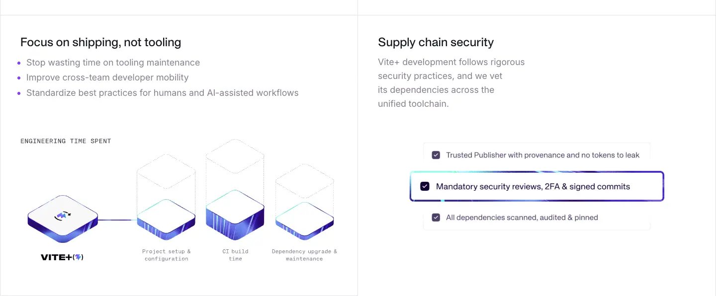
- Left: "Focus on shipping, not tooling". Three grey bullets: "Stop wasting time on tooling maintenance", "Improve cross-team developer mobility", "Standardize best practices for humans and AI-assisted workflows". Rive animation labelled
ENGINEERING TIME SPENT with blocks for project setup, CI build time, dependency upgrades.
- Right: "Supply chain security". Copy: "Vite+ development follows rigorous security practices, and we vet its dependencies across the unified toolchain." Checklist art: Trusted Publisher with provenance · Mandatory security reviews, 2FA & signed commits (raised, indigo outline) · All dependencies scanned, audited & pinned.
- Why. These two panels speak to the buyer above the developer (an engineering lead): time saved and risk reduced. "AI-assisted workflows" ties the tool to the current way teams work.
§7 · Toolbox intro + tabs · y 2953–3359
- Dark band starts (
#16171d, hairlines turn #3b3440). Fixed 352px intro: H2 "Everything you need in one tool" (APK 48/48 white, −1.2px), lead "Vite+ unifies your entire web development workflow into a single, powerful command-line interface." (white 70%, max 448).
- Tab bar: 5 × 287px mono tabs with icons:
dev & build · check · test · run · pack, sliding 2px white underline (300ms ease-out).
- Why. The colour switch says "you are now inside the tool". The tabs are a map of the five rows.
§8–12 · Five tool rows · y 3359–5769
| § |
Eyebrow |
H4 |
Bullets (sample) |
Texture |
Powered by |
| 8 |
VITE+ DEV & BUILD |
Blazingly fast builds |
Always instant Hot Module Replacement (HMR) · 40× faster production build than webpack · Opt-in full-bundle dev mode for large apps · Huge ecosystem of plugins |
violet vite.jpg |
Vite & Rolldown |
| 9 |
VITE+ CHECK |
Format, lint, and type-check in one pass |
Prettier compatible formatting · 750+ ESLint compatible rules · Type-aware linting and fast type checks with tsgo · vp check --fix auto-fixes where possible |
cyan oxc.jpg |
Oxc / Oxlint · Oxc / Oxfmt |
| 10 |
VITE+ TEST |
Testing made simple |
Jest compatible API · Test isolation by default · Browser Mode · Coverage reports, snapshot tests, type tests, visual regression tests |
green vitest.jpg |
Vitest |
| 11 |
VITE+ RUN |
Vite Task for monorepos and scripts |
Automated input tracking for cacheable tasks · Dependency-aware execution across workspace packages · Familiar script execution via vp run |
indigo viteplus.jpg |
— (cache-state switch instead) |
| 12 |
VITE+ PACK |
Library packaging with best practices baked in |
DTS generation & bundling · Automatic package exports generation · Standalone app binaries and transform-only unbundled mode |
orange rolldown.jpg |
Rolldown / tsdown |
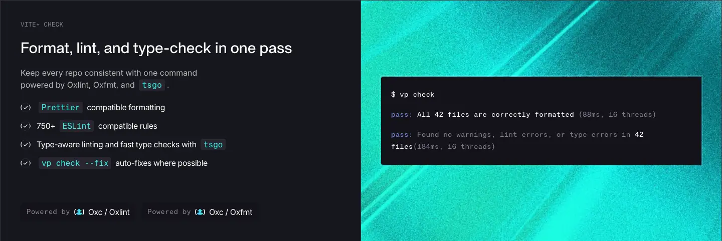
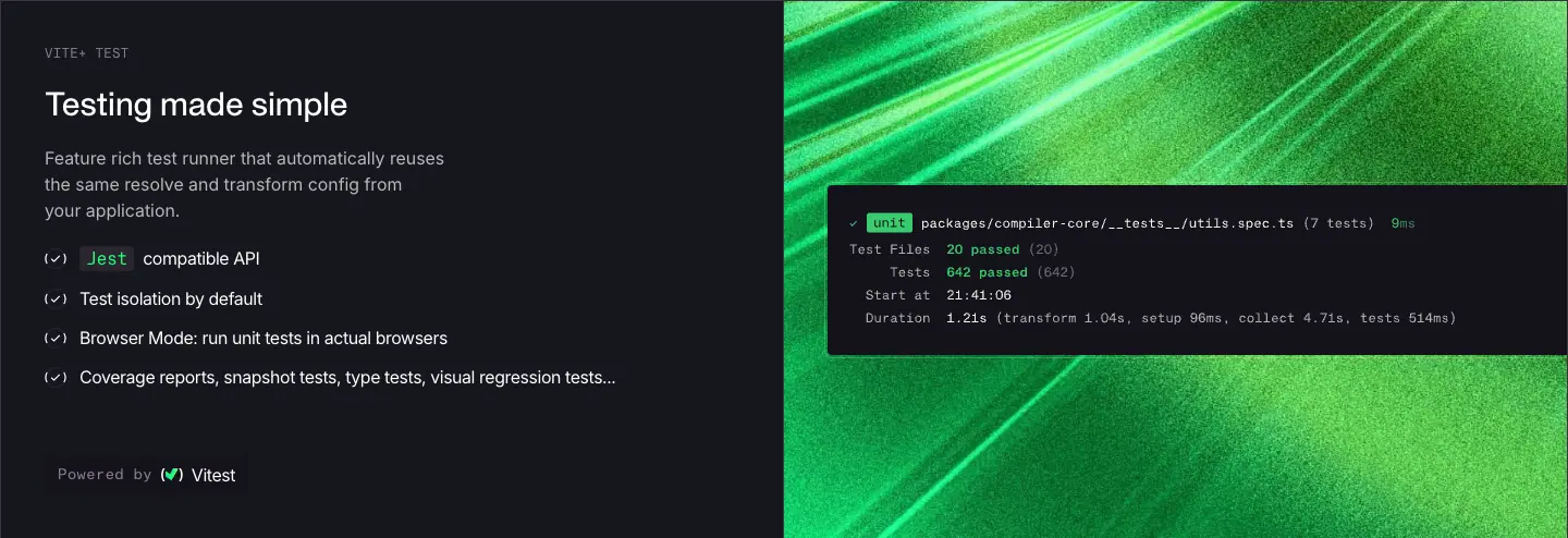
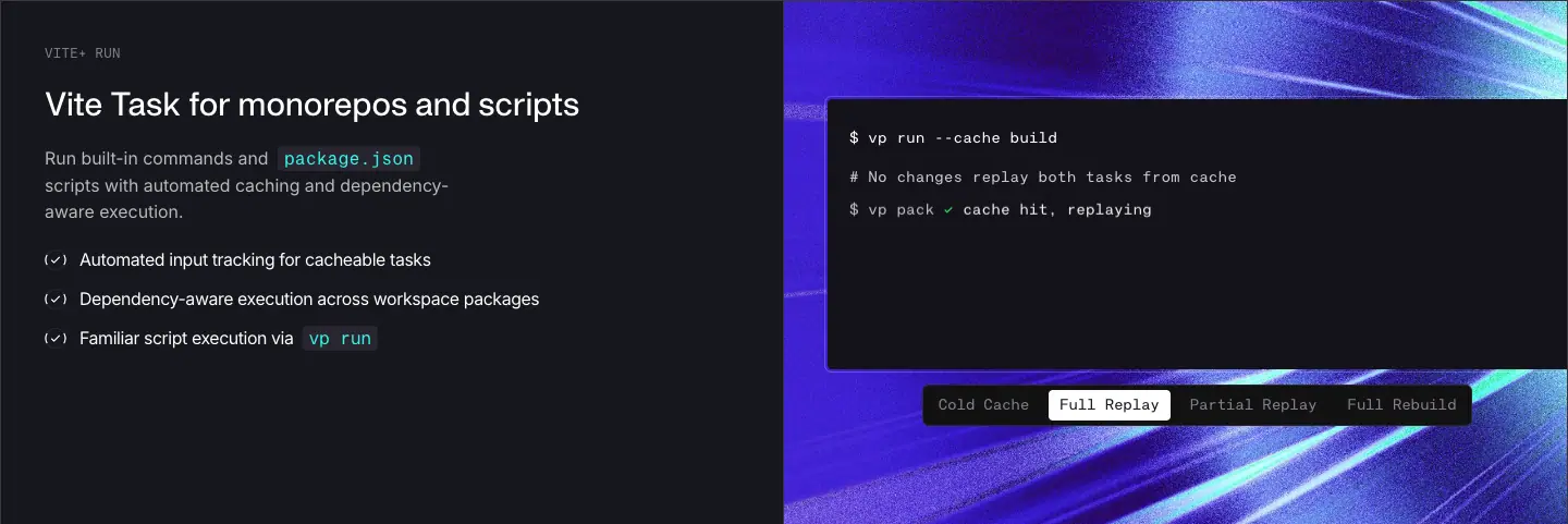
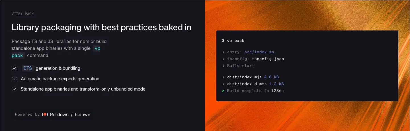
- Each row: 50/50, ≈480px tall. Left cell 40px padding,
justify-between with a 60px gap between the copy block and the "Powered by" line. Right cell: texture with a terminal window (left-anchored, pl-10) that shows the real command (vp build, vp check, vp test, vp run --cache build, vp pack) and its output.
- Inline code chips use the tool's own colour (
text-vite #b39aff, text-aqua #32f3e9).
- Why. Identical structure × 5 makes the rows scannable and comparable. The changing hue makes each one memorable. The terminal outputs carry the proof (timings, file counts, "cache hit, replaying").
§13 · "Fullstack? No problem." · y 5769–6089
- Back to white. Fixed 320px, left-aligned H3 (APK 40/53.3, −1px), lead "Vite+ can be the foundation of any type of web apps – from SPAs to fullstack meta frameworks."
- Why. Handles the objection "only for single-page apps?" right after the product band.
§14 · Frameworks + platforms · y 6089–6633
- Left on warm
#f9f8f5: "Meta Frameworks · You can use meta-frameworks that ship as Vite plugins with Vite+", hub diagram (meta-frameworks.png, 638 × 310).
- Right: "Platform Agnostic · First-class support on Vercel, Netlify, Cloudflare & more", monochrome logo strip (Vercel, Netlify, Cloudflare, Render), then the Nitro panel on texture with a
vite.config code sample.
- Why. Covers the two lock-in fears: framework and host.
§15 · Isometric system diagram · y 6633–7405
- A 120px ticked spacer row, then a full-bleed 1440 × 652 Rive canvas (
1280_x_580_vite__masthead.riv). Files flow into the Vite+ board; command keys pop; engine plates light. See frame strip in 11 · Motion.
- Why. A wordless summary of the whole page, placed just before the close.
§16 · Free & open source · y 7405–7849
- Dark again. Left (60px inset): H3 white "Free & open source", copy "Vite+ is free and open source, made possible by a full-time team and passionate open-source contributors." (white 70%, max 512), outline "Contribute" button. Right: textured VoidZero cube + "Brought to you by VOID(Ø)".
- Why. "Full-time team" answers "will this be maintained?". The VoidZero lockup names the company that backs it.
§17 · Final CTA · y 7849–8284
- 434px,
footer-background.jpg (indigo ray burst), 120px vertical padding. H2 "Take your team's productivity to the next level with Vite+" (white, drop-shadow-sm/70), white primary button "Get started".
- Why. Ends on team value (the buyer) and the same single action as the hero.
§18 · Footer · y 8284–8806
- Ticked ruled rows on
#16171d. COMPANY: VoidZero, Vite, Vitest, Rolldown, Oxc. SOCIAL: GitHub, X.com, Discord, Bluesky. Copyright bar "© 2026 VoidZero Inc. and Vite+ contributors." (Inter 14, #867e8e, 20px padding).
- See Header and footer.
Responsive
| Width |
What changes |
| 768 |
Splits stack to one column below md/lg; tool rows stack copy above texture; page grows to 10,737px (capture) |
| 390 |
H1 36/40; H2 30/36; H4 20/28; cells 20 × 24 padding; terminal padding 16 × 20; isometric stat tiles hidden (hidden sm:block); page 11,856px (capture) |
Docs template · /guide, /config, /guide/package-management
Captured: /guide/ (dark and light), /guide/why, /config/, /guide/package-management/install. 82 of the site's 84 pages use this template (see Public pages).
Engine: VitePress v2.0.0-alpha.20 (<meta name="generator">), with a custom viteplus theme variant (data-variant="viteplus").
| Dark (system default in the capture browser) |
Light |
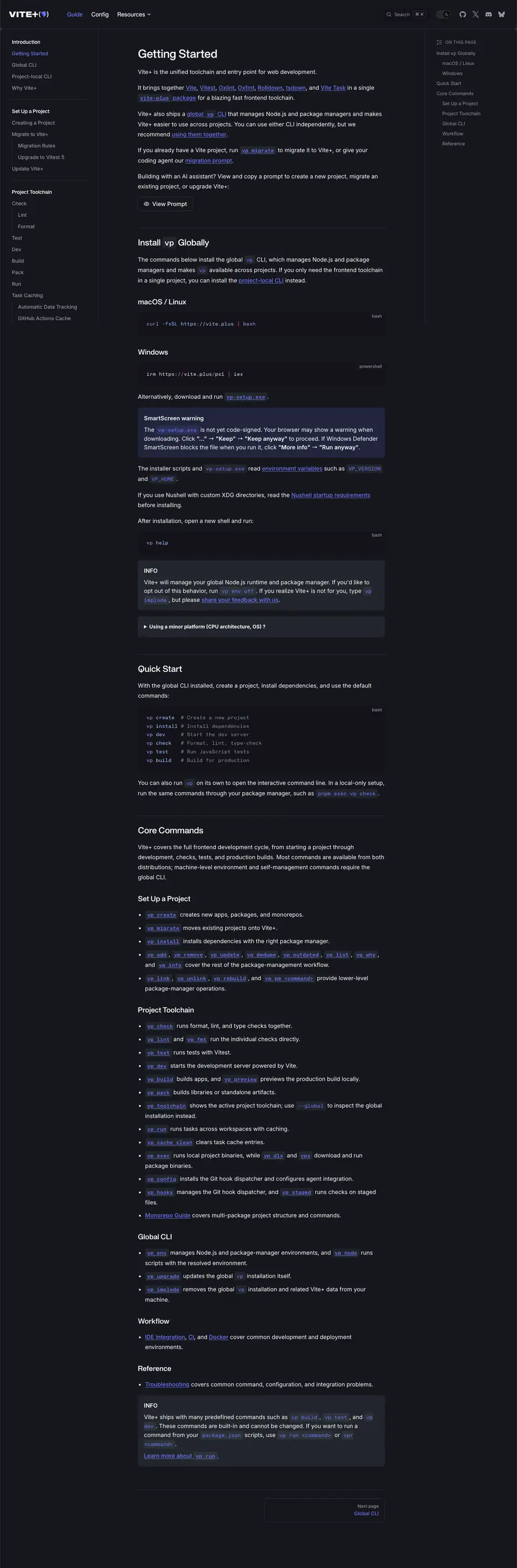 |
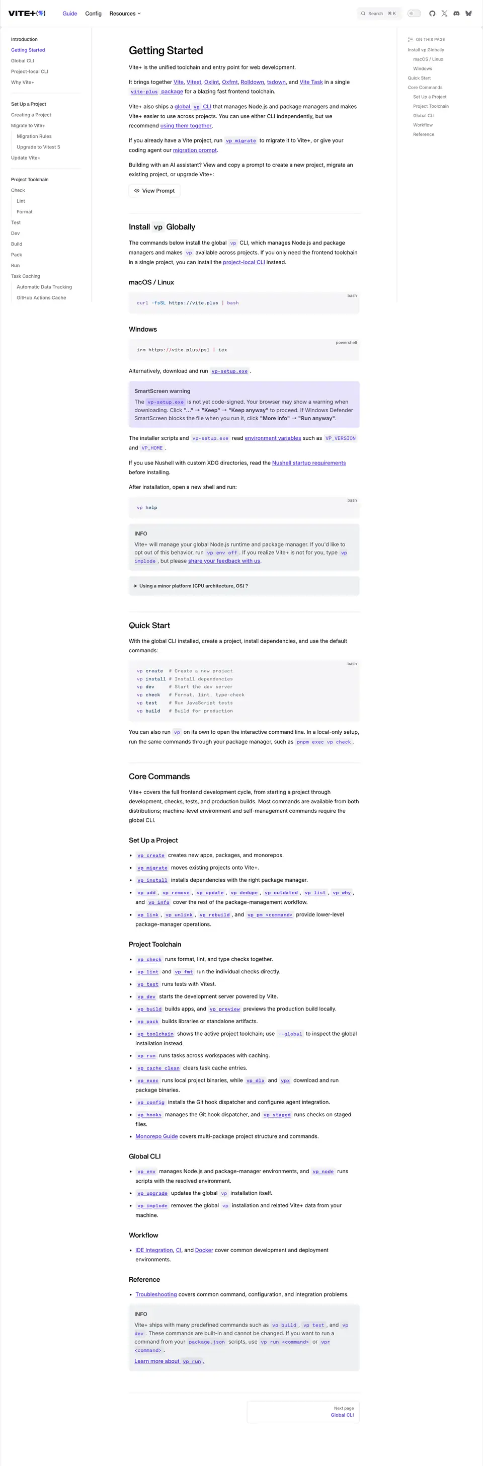 |
Layout
| Region |
Measured at 1440 |
| Header |
Shared 81px ruled header, fixed (lg:fixed), adds a theme switch |
| Sidebar |
272px wide, padding 20 / 32 / 96, fill --vp-c-bg-alt (#f6f6f7 / #14121a) |
| Content |
688px column starting at x = 384 |
| Outline aside |
191px at x = 1216, "ON THIS PAGE" |
| Page heights |
Guide 4,369 · Install 4,899 · Why 2,432 · Config 2,071 |
Sidebar
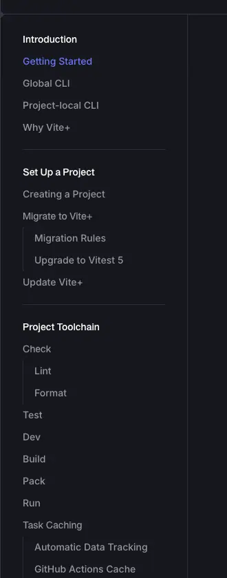
- Groups: Introduction · Set Up a Project · Project Toolchain · Package Management (Core Commands, Forwarded Commands collapsed) on
/guide/; Config has its own sidebar.
- Group title: APK Protocol 14/24, 700, text-1. Item: 14/24, 500, text-2. Nested items are indented. Active item in brand colour.
- Why. The groups follow the user's journey (install → set up → daily commands → package management), not the code structure.
Content typography
| Element |
Measured |
| H1 |
APK Protocol 32/40, 600 (renders the 700 file), −0.64px |
| H2 |
APK Protocol 24/32, 600, −0.48px, top rule |
| H3 |
APK Protocol 20/28, 600, −0.2px |
| Body |
Inter 16/28, #000 light (measured) / #fff dark |
| Link |
Inter 16/28 500, #4f30e8 / #6b77f8, underline |
| Inline code |
KH Teka Mono 14, 500, brand colour on a 14–16% grey-blue fill, radius 4, padding 3 × 6 |
Code blocks
- Fill
#14121a dark / #f6f6f7 light, radius 8, KH Teka Mono 14/23.8, language label top-right (bash, powershell).
- Syntax colours (dark, measured): commands
#b392f0, URLs #9ecbff, comments #818e99. Light: #6f42c1, #032f62, #62687b.
- Comment-aligned command lists (
vp create # Create a new project) make code blocks double as reference tables.
Custom blocks
- INFO / details:
rgba(101,117,133,.16) fill, radius 8, padding 16 16 8, 14px text, uppercase bold title.
- Warning ("SmartScreen warning"): same shape, title 16/24 600.
- Collapsible
<details> for edge cases ("Using a minor platform (CPU architecture, OS)?").
- Why. Warnings that only matter to some readers are boxed or collapsed, so the main path stays short.
Command reference pages
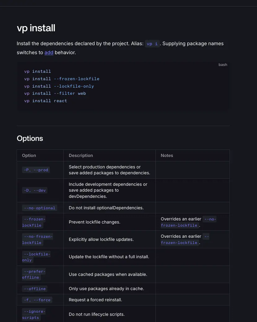
/guide/package-management/install pattern: H1 = the command (vp install), overview, then H2 "Options" with a list or table of flags, then examples. Every page in the Package Management group (41 pages) follows this shape.
Pager
- Prev / next cards 336 × 66, 1px
#2e2e32 border, radius 8; grey label "Next page" + brand-colour title.
Dark vs light
| Token |
Light |
Dark |
| Background |
#ffffff |
#16171d |
| Sidebar, code |
#f6f6f7 |
#14121a |
| Text 1 / 2 / 3 |
#3c3c43 / #67676c / #929295 |
#ffffff / #98989f / #6a6a71 |
| Brand |
#4f30e8 |
#6b77f8 |
| Divider |
#e2e2e3 |
#2e2e32 |
Mobile
390 capture: the sidebar collapses into a menu; content goes full width; the header keeps wordmark, search and menu.
404
The VitePress 404 page, in the same header and fonts.
Why the docs look like this
- VitePress, re-skinned. Developers already know VitePress from vite.dev and vitest.dev. Keeping its layout means zero learning; changing only fonts and colour keeps the brand.
- Dark follows the system. Docs are read for long sessions in editors that are usually dark. The marketing page forces light because its art (grey line drawings) is drawn for white.
- Display face on headings, Inter for body. The same split as the marketing page, so moving from home to docs feels continuous.
Team · /team
URL: https://viteplus.dev/team · Height: 2,527px · uses the docs theme (dark by system default, light captured too)
| Dark |
Light |
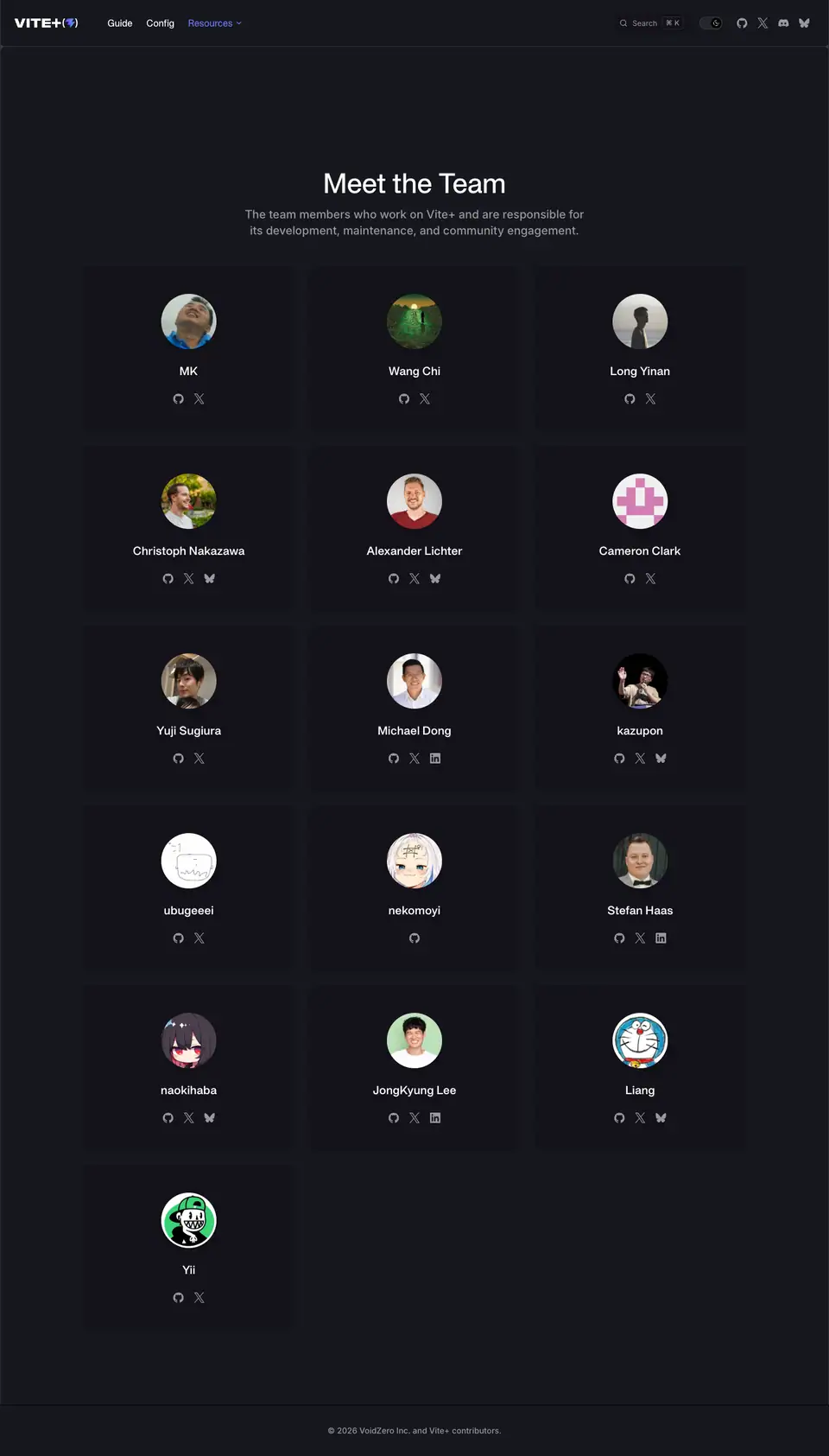 |
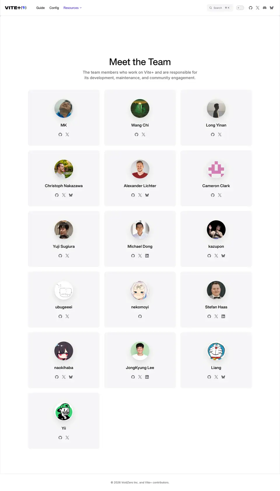 |
Sections
Header block
- Centred H1 "Meet the Team" (APK Protocol 48/56, 500, white) and a two-line subtitle (Inter 20/28, 500,
#98989f, 592px wide): "The team members who work on Vite+ and are responsible for its development, maintenance, and community engagement."
- Why. One sentence of purpose; the people do the rest.
Member grid
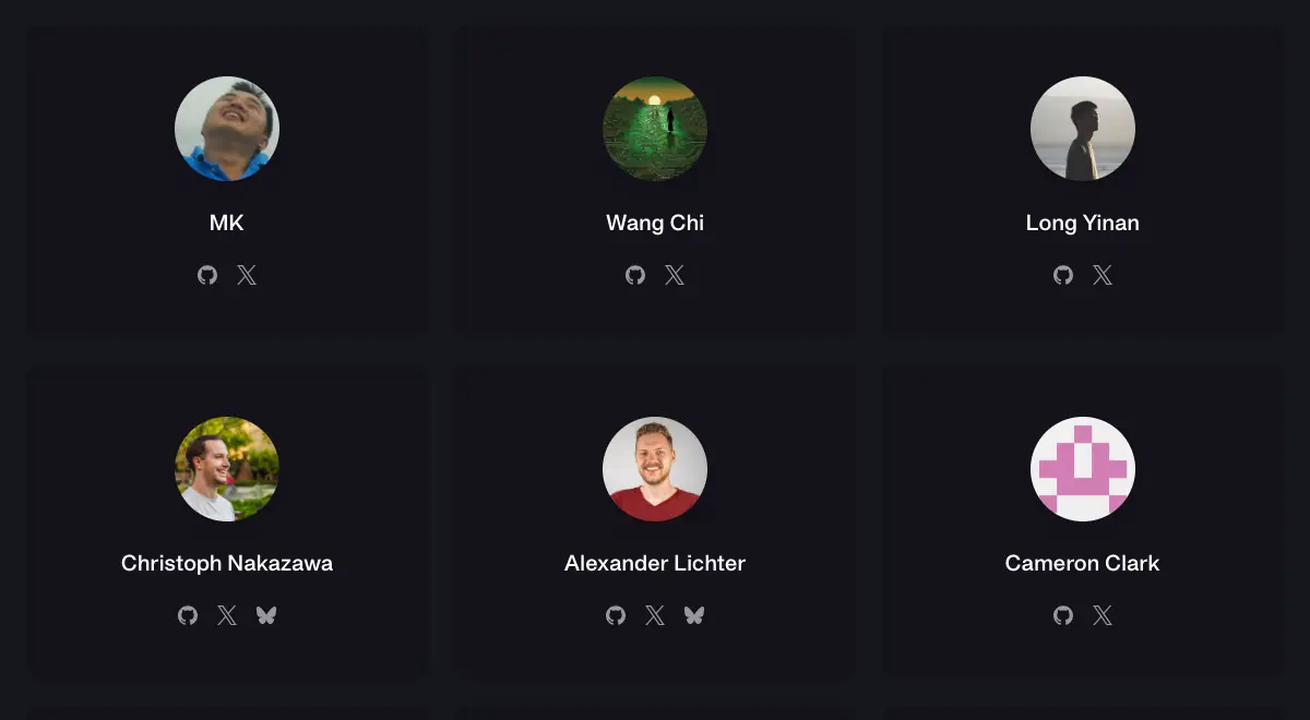
- 3 columns, 16 members (16
.VPTeamMembersItem elements). Each card is 368 × 288: circular avatar 96 × 96, name in APK Protocol 20/28 600 (+0.15px), then 2–3 social icons (GitHub, X, Bluesky or LinkedIn) in grey.
- The card panel uses the VitePress soft background (
#14121a dark, #f6f6f7 light, ≈ from the screenshots) with no border.
- Why. No titles or bios: the page lists the maintainers and links to their public profiles, which is how open-source contributors are judged.
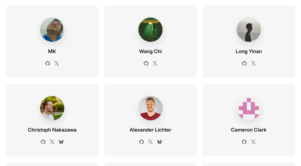
Notes
- The page is VitePress's built-in team component (
VPTeamMembers) styled with the brand fonts.
- Member names and avatars are public GitHub data; this research only shows the layout.